
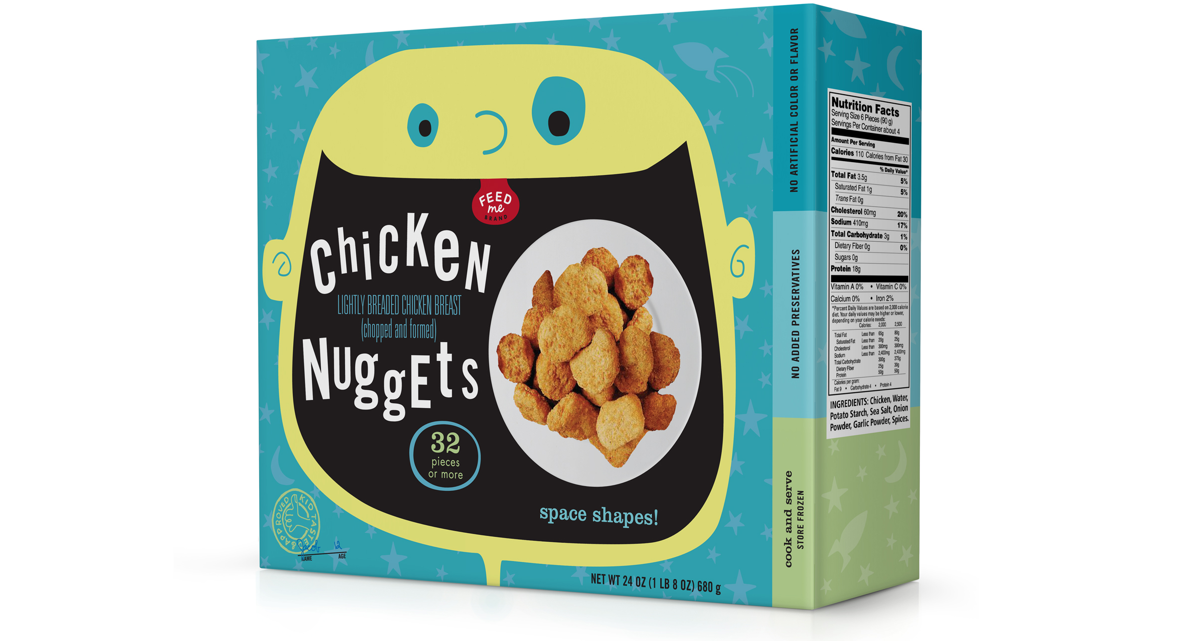
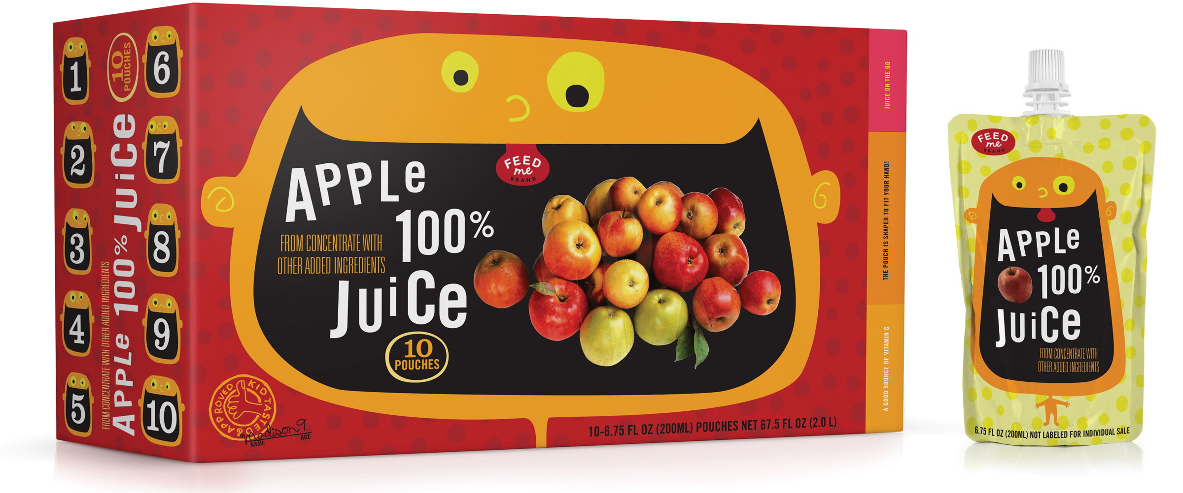
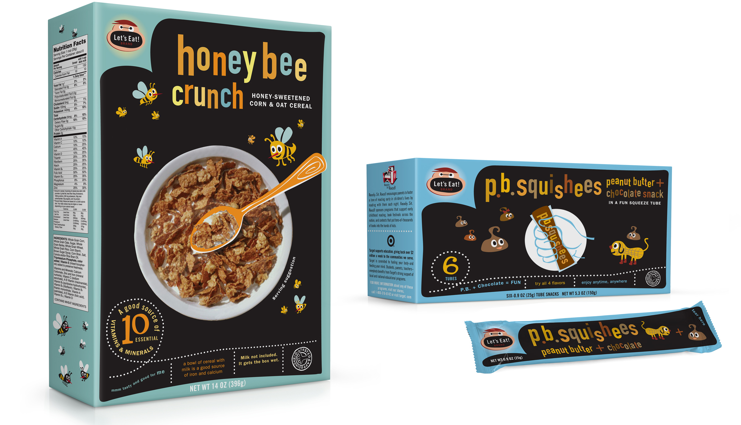
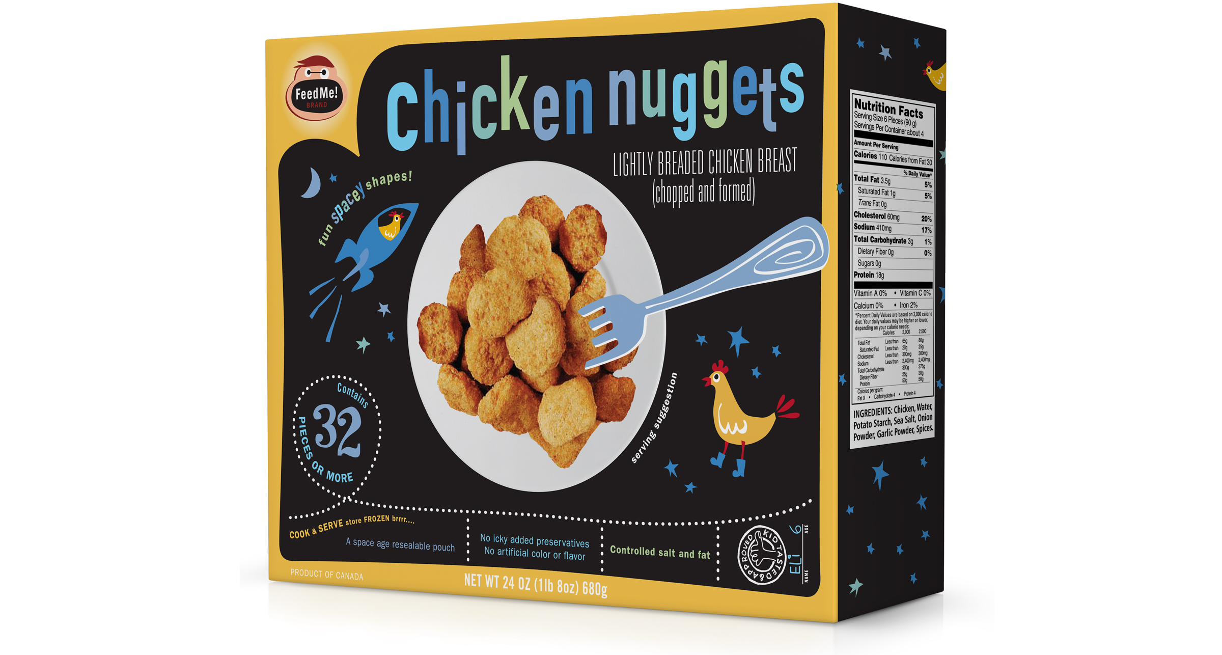
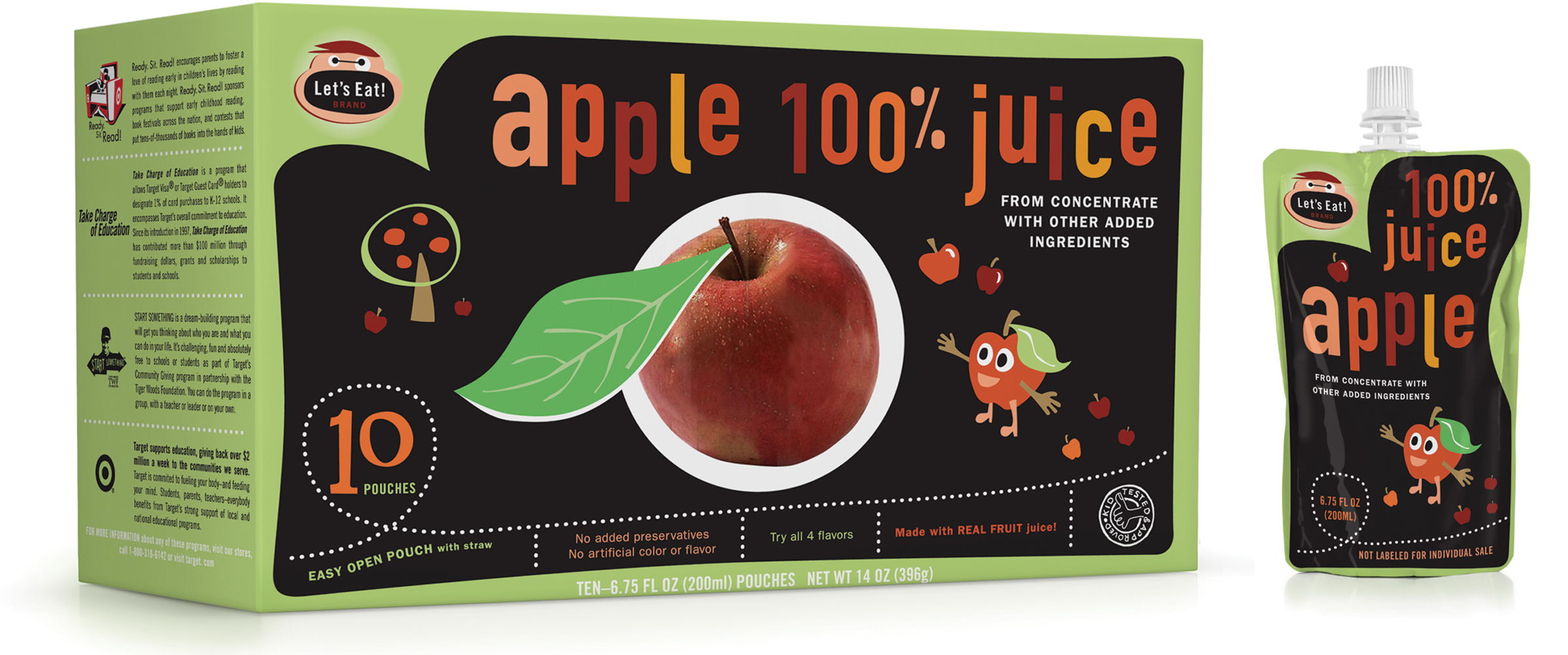
The second direction used a chalkboard-like black background with goofy illustrations to highlight the products and flavors.
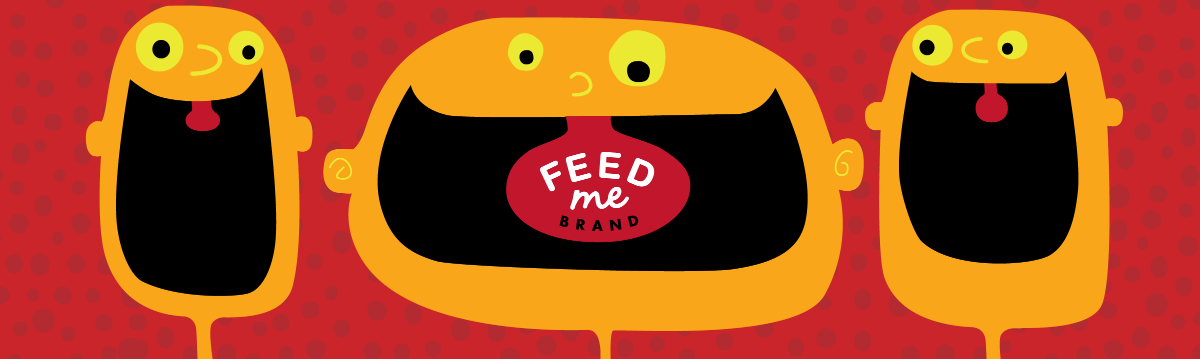
We presented multiple names and logos for the brand, some of which are shown here.
Target was considering creating its own brand of kids’ foods. We worked with the company to develop a name for the brand as well as concepts for the packaging system. There were two concept directions for the packaging that we felt best fit the strategy and goals for the brand. Both directions were bright, fun and kid-friendly, and also highlighted nutrition information for parents. Ultimately, Target decided not to go forward with the project for several reasons, including the inability to create food that was tastier and healthier at a lower price than competing brands.
The second direction used a chalkboard-like black background with goofy illustrations to highlight the products and flavors.
We presented multiple names and logos for the brand, some of which are shown here.
© 2026 Werner Design Werks