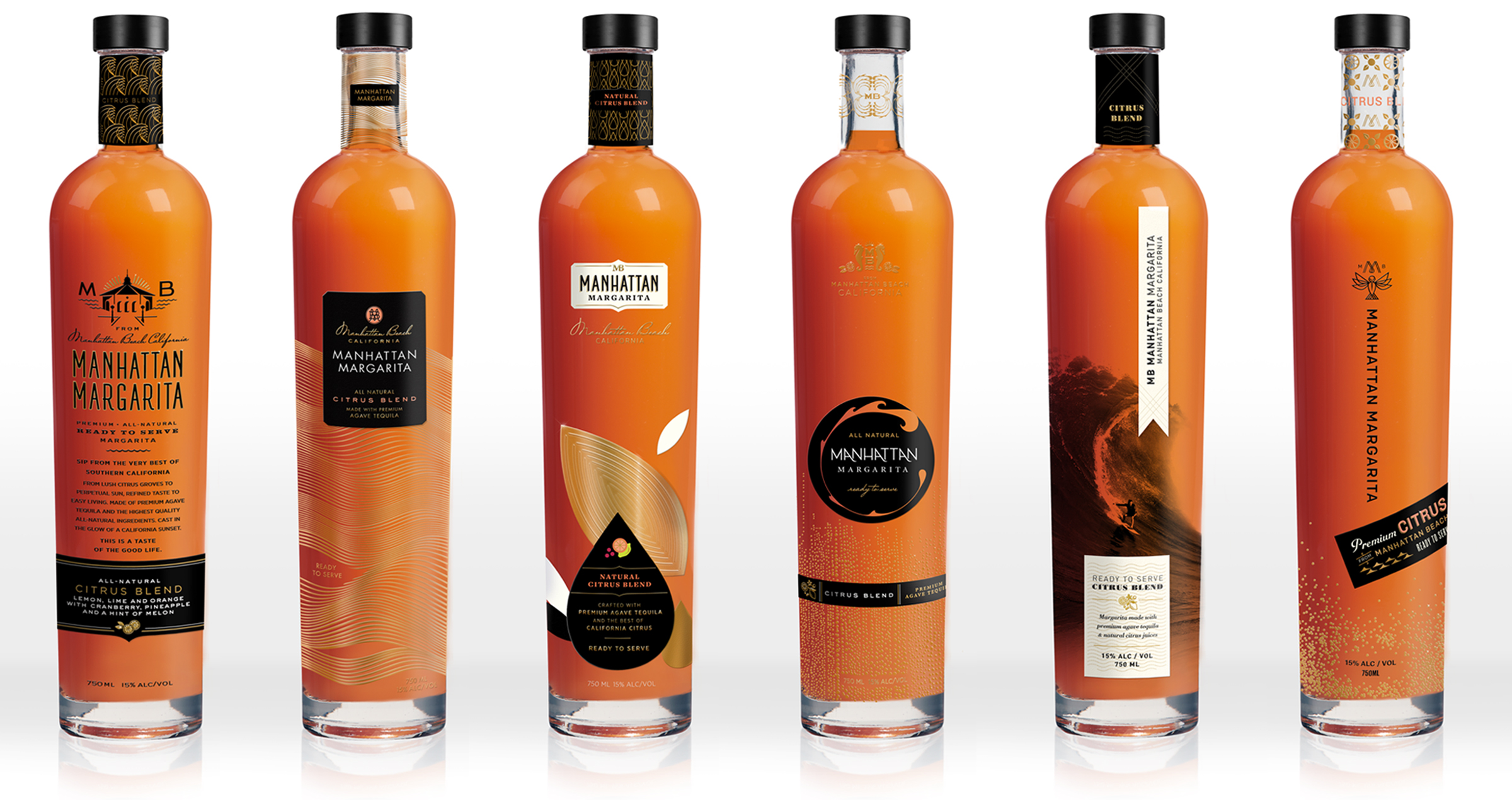
It was important to find the right balance between the sophistication of the cocktail and the founder’s passion for Manhattan Beach with its relaxed, laid-back beach lifestyle. With these considerations in mind, we presented several different directions, each one emphasizing these qualities to varying degrees, as well as different aspects of the brand. One shows a famous MB landmark and leans more toward a premium spirits bottle, while another one with its bold iconic wave and surfer is definitely more beachy. Leaves and a large droplet play up the natural juice element of the product, as does a hummingbird which reminds us to savor every minute. The unexpected beautiful, natural, coral color of the liquid was a significant aesthetic element in all the design directions.
Manhattan Margarita
The margarita, reinvented
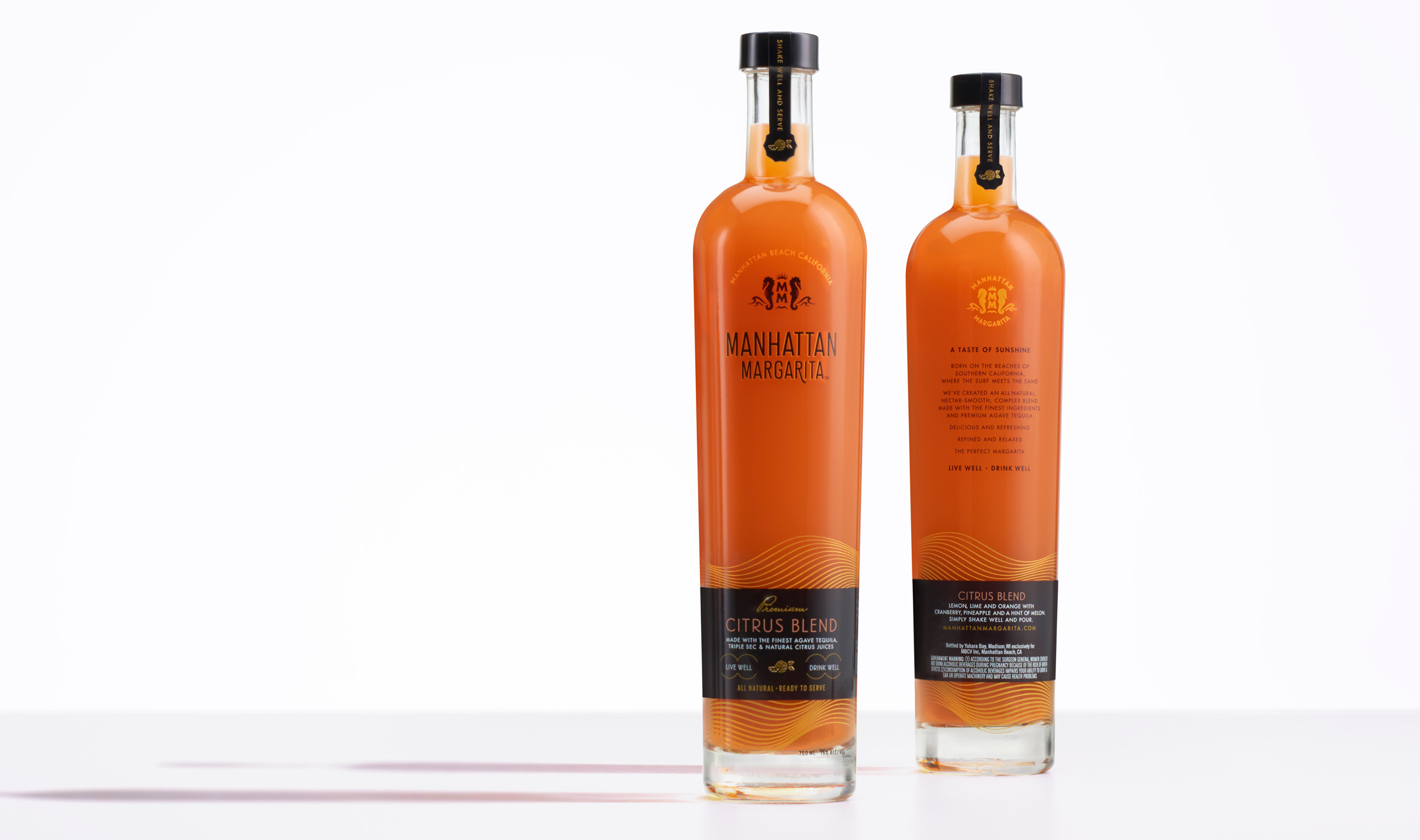
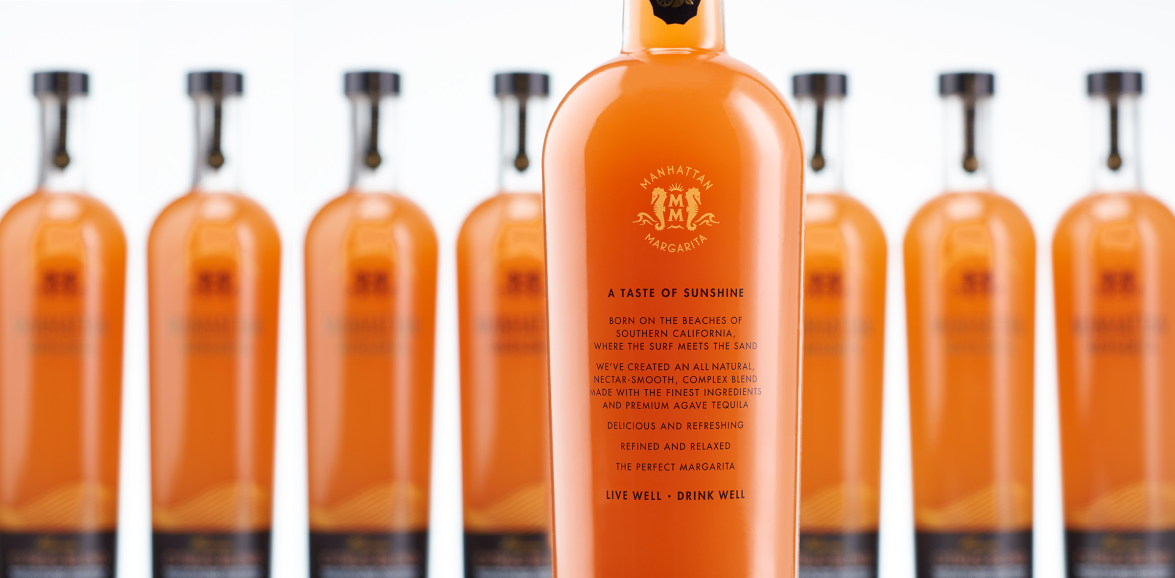
A taste of sunshine, Manhattan Margarita was born on the beaches of southern California, where the surf meets the sand. The premium, ready-to-serve citrus blend cocktail redefines what a premixed margarita should be. We developed a brand language that reflects the sophisticated and healthy Manhattan Beach lifestyle mixed with premium spirits.
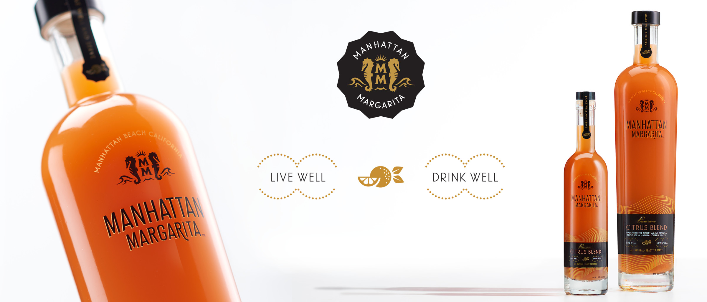
The essence of Manhattan Beach, California (distinctly different from the Manhattan on the other coast) is captured in the gentle golden waves wrapping around the bottle, with the distinctive color of the liquid reflecting off the gold, like sunset on the ocean. Regal seahorses are symbols of good luck and grace, and represent the power of the ocean. The look is relaxed and refined, fresh and modern.
Manhattan Margarita. Live well. Drink well.