Editorial Visual System: Building Blocks
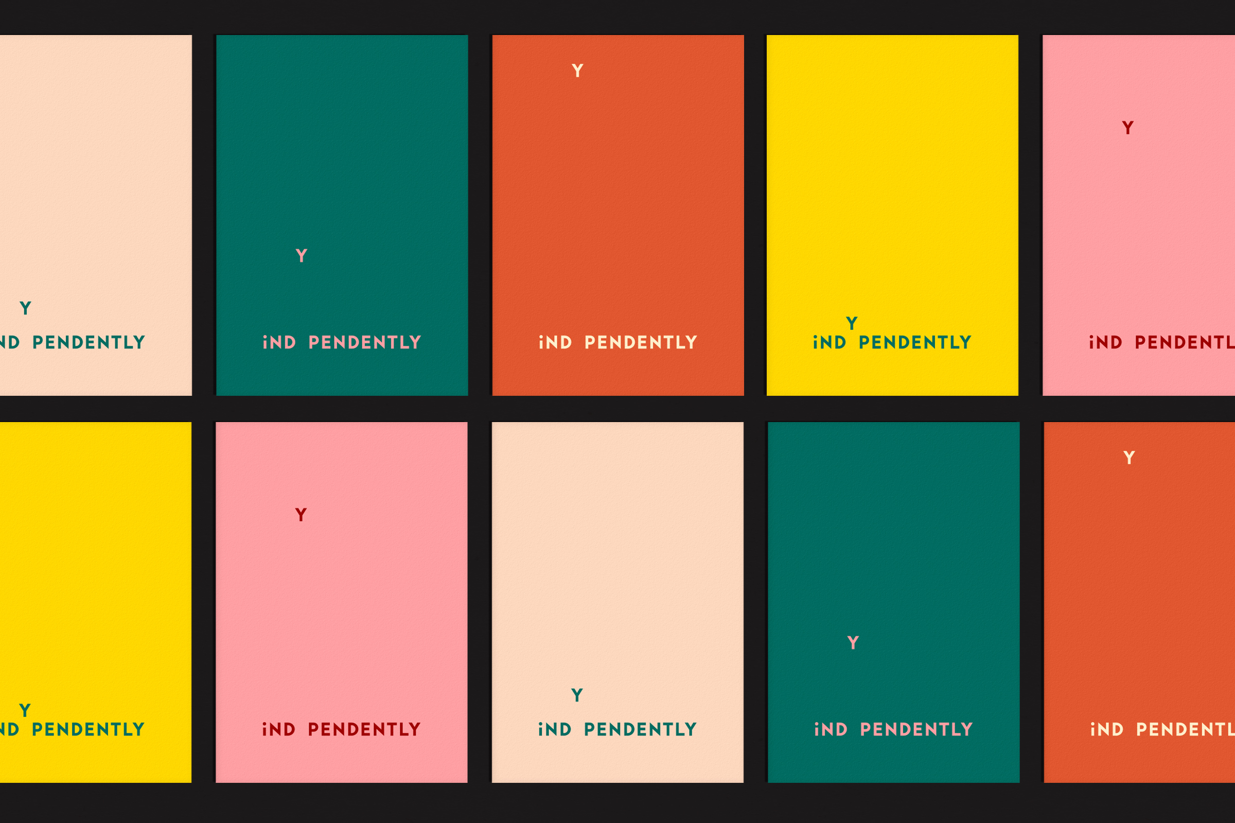
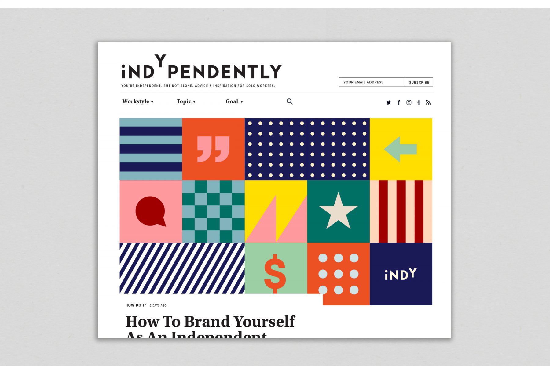
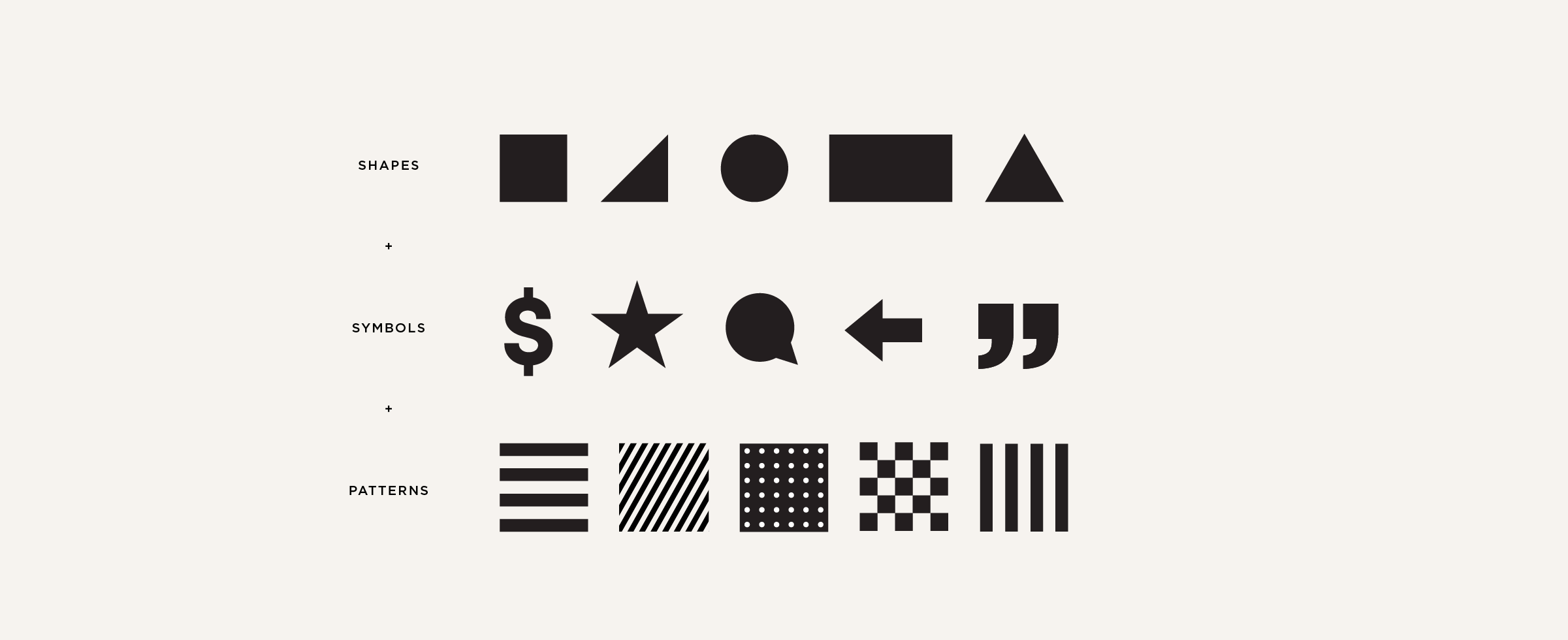
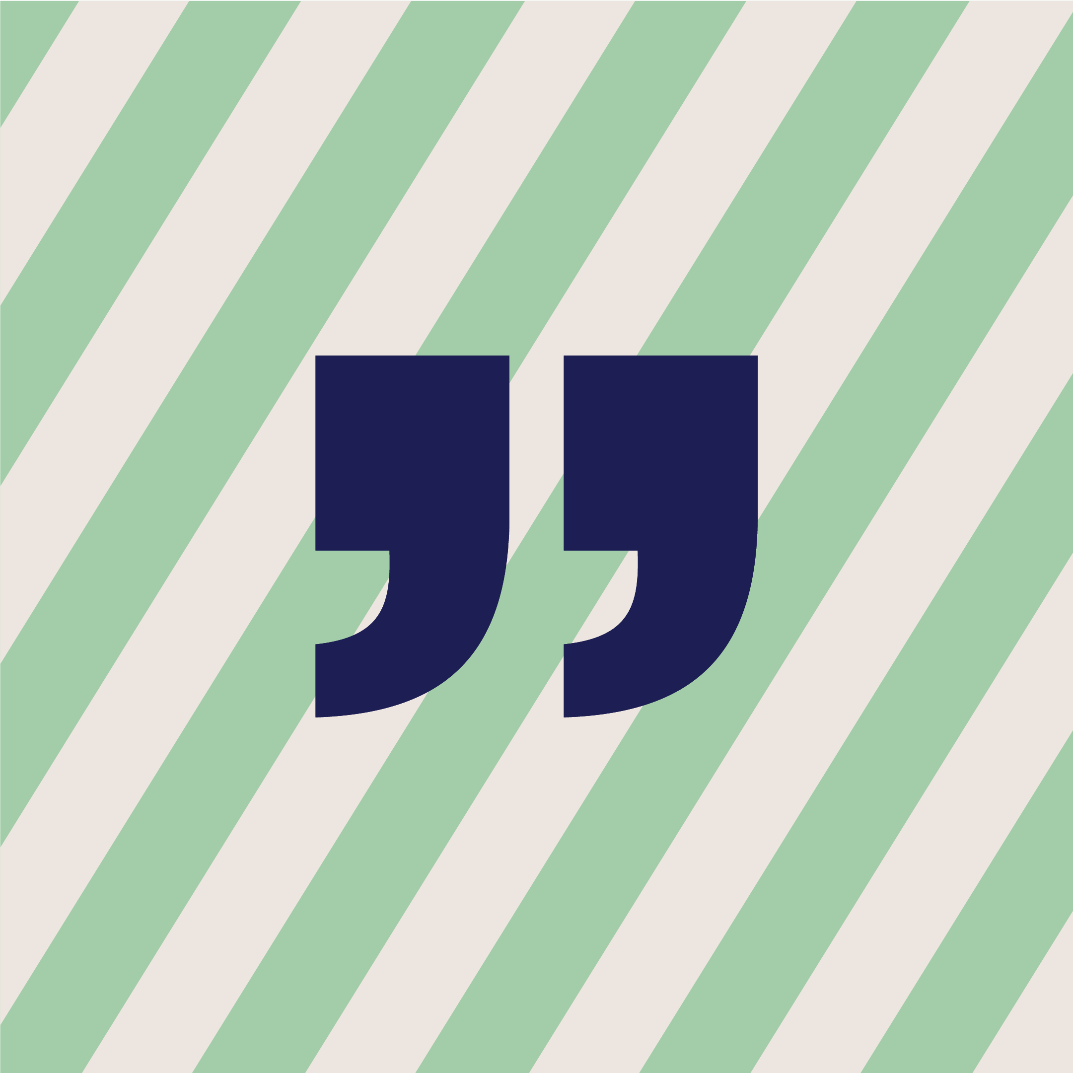
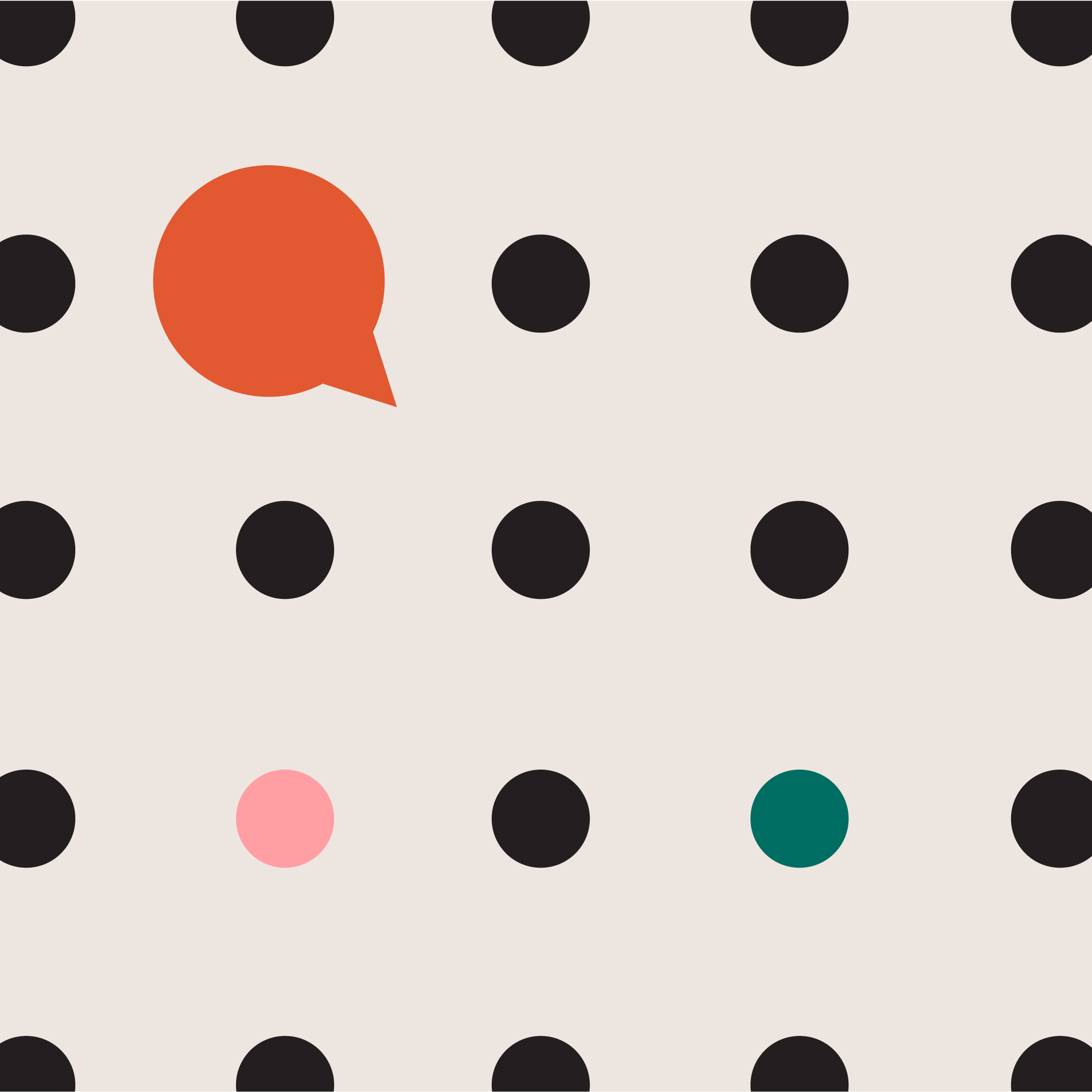
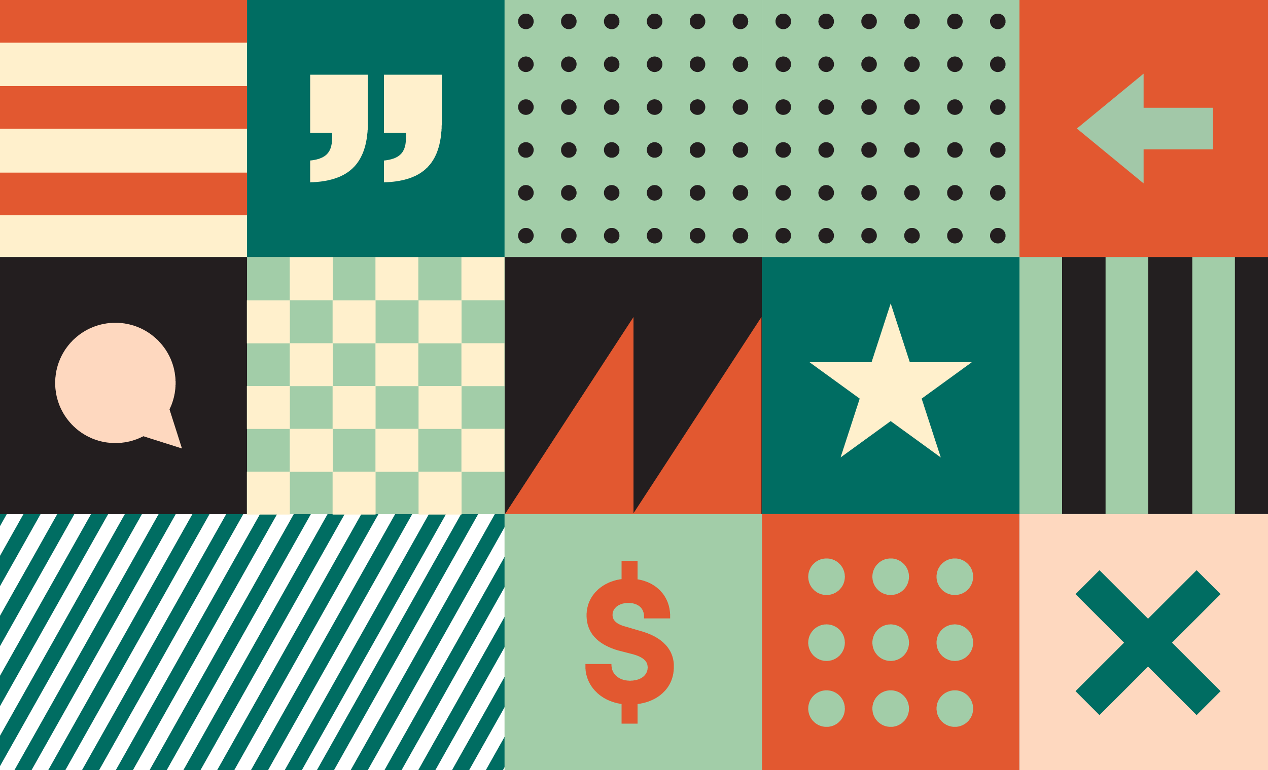
For Indypendently’s editorial visual system, we designed several categories of illustration styles, typographic systems, and photo treatments. The underpinning of the entire system is a library of simple shapes, symbols, and patterns which can combine in endless ways to create minimal abstract illustrations.

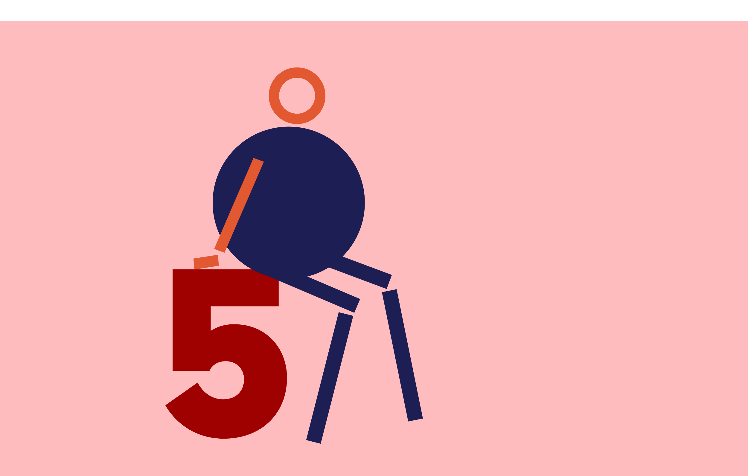
Stick Figures
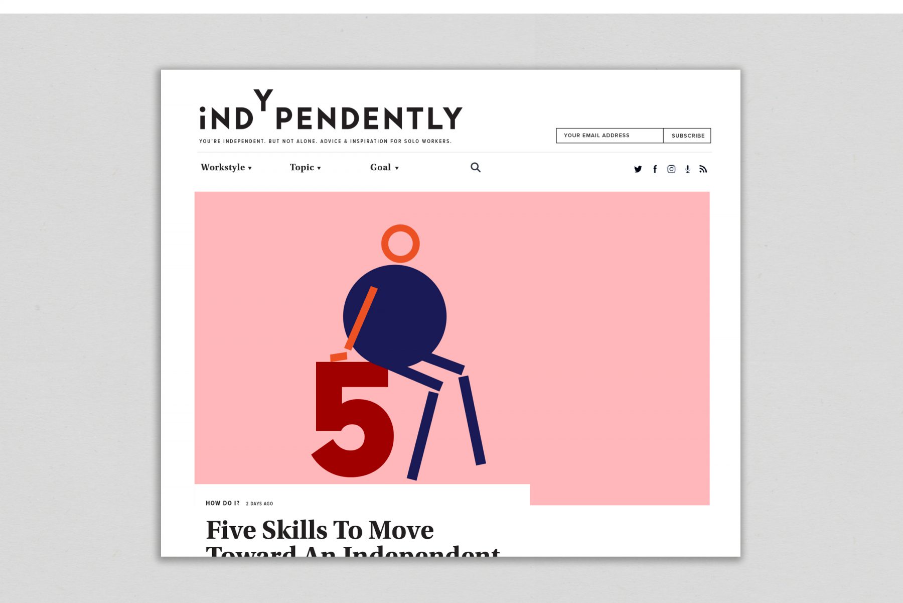
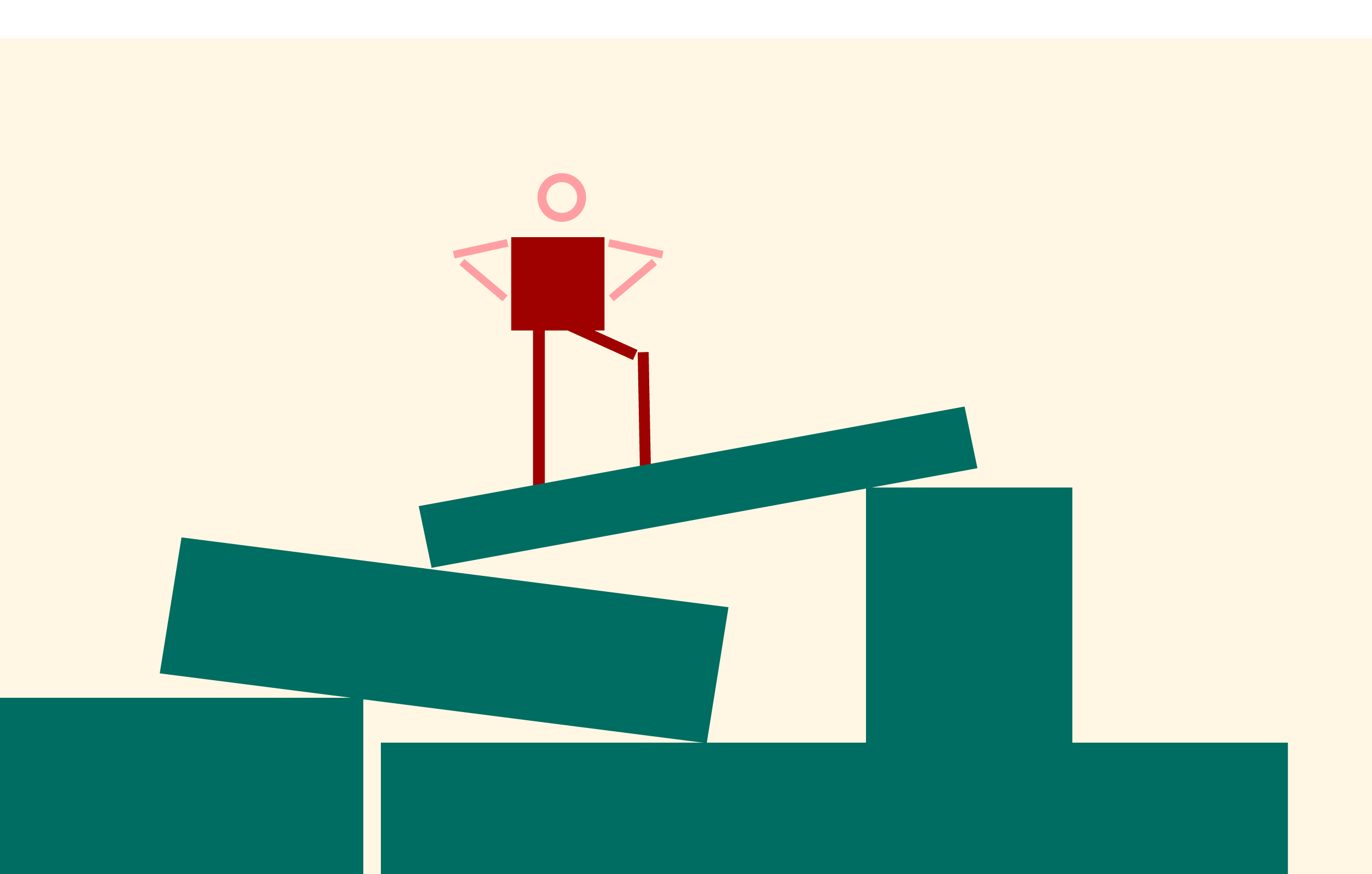
Stick figure illustrations take the brand’s building blocks one step further, literally adding life to simple shapes and enabling the team to create emotion, interaction, and personality in an easy-to-execute format.


Conceptual Illustrations
When time and budget permit, an illustrator can use the brand’s foundational shapes and symbols to create unique conceptual images.


Type Treatments
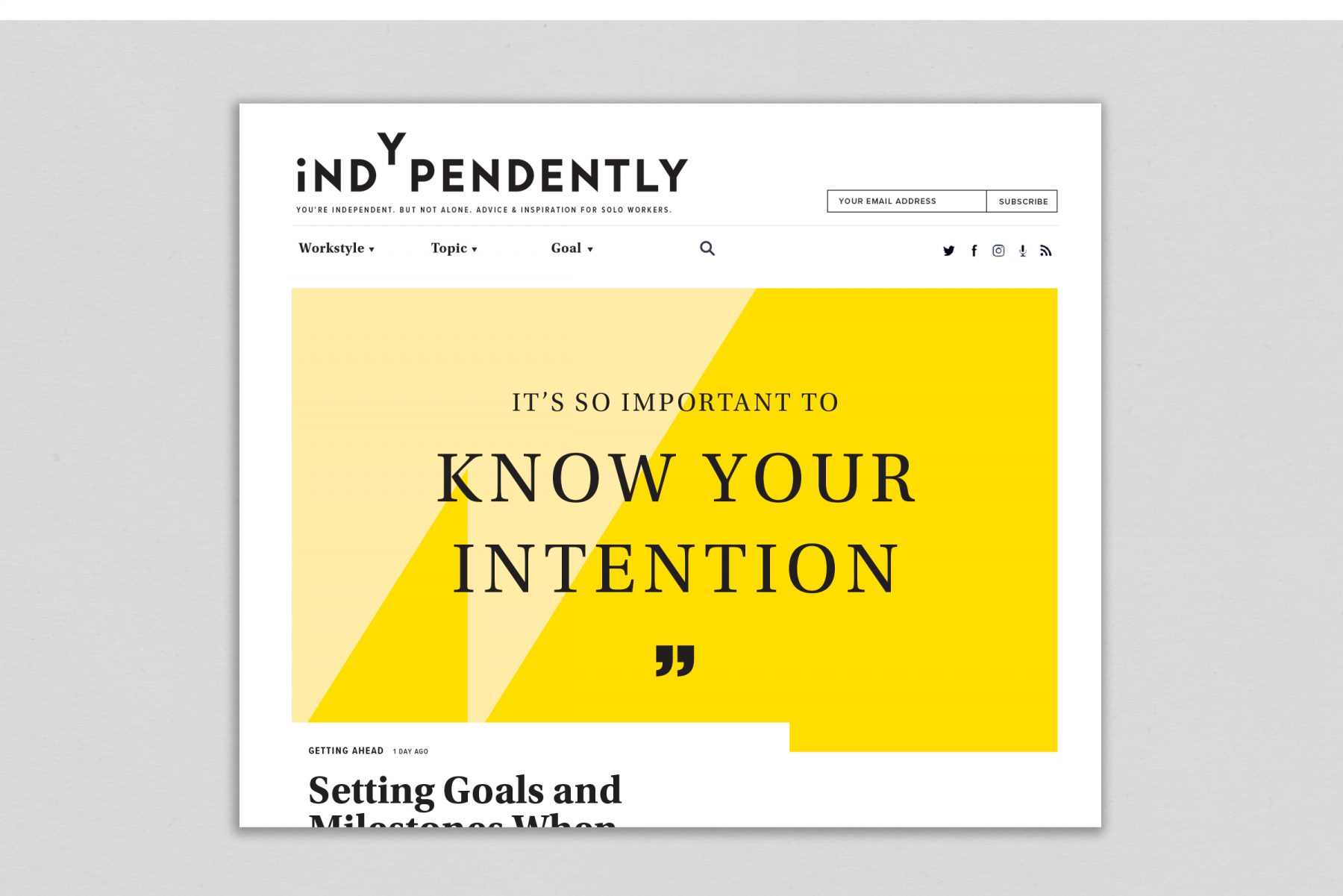
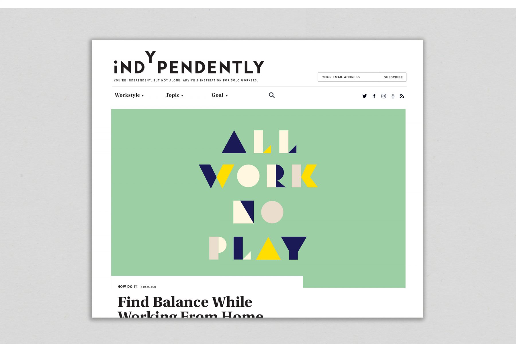
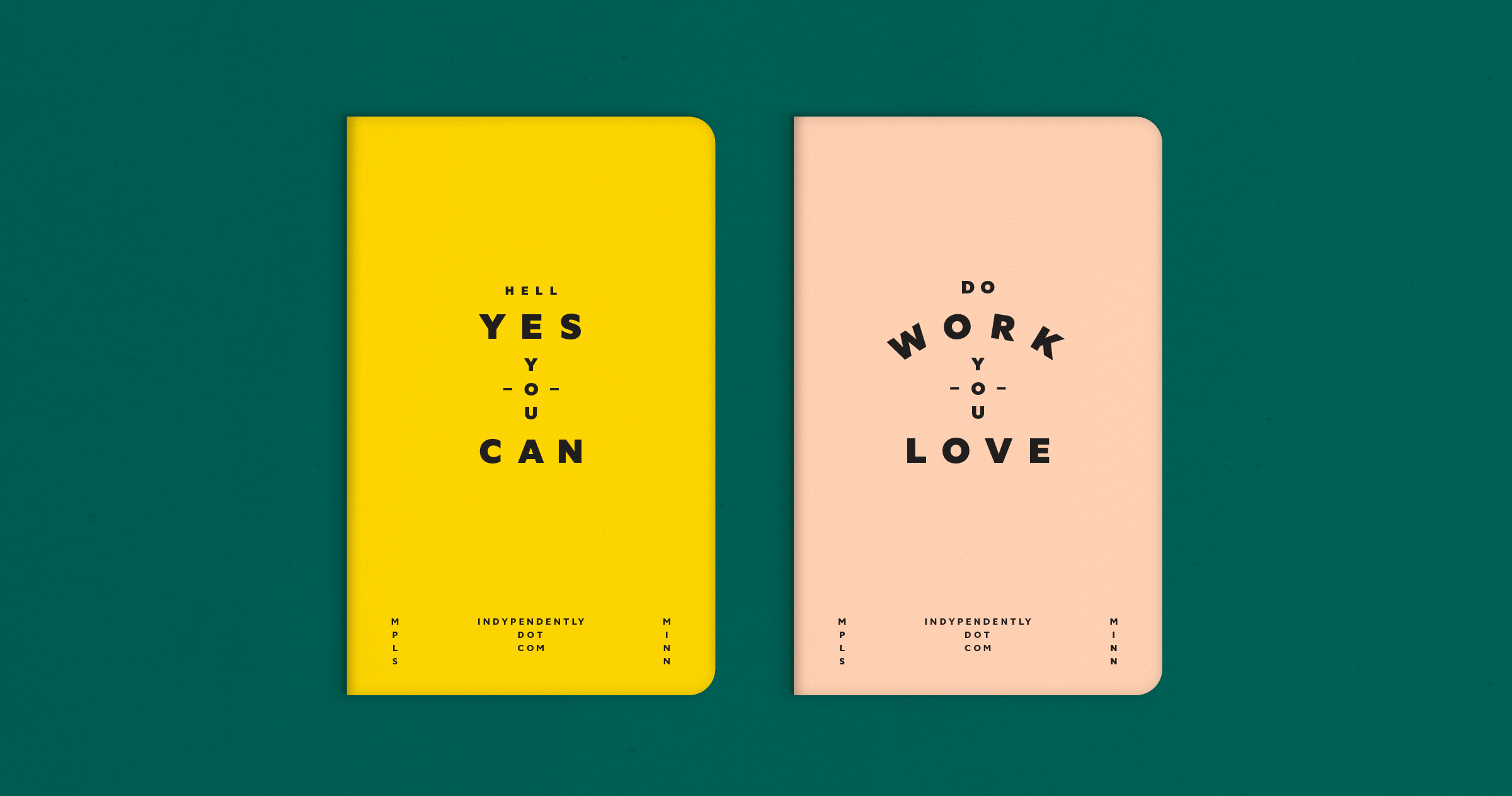
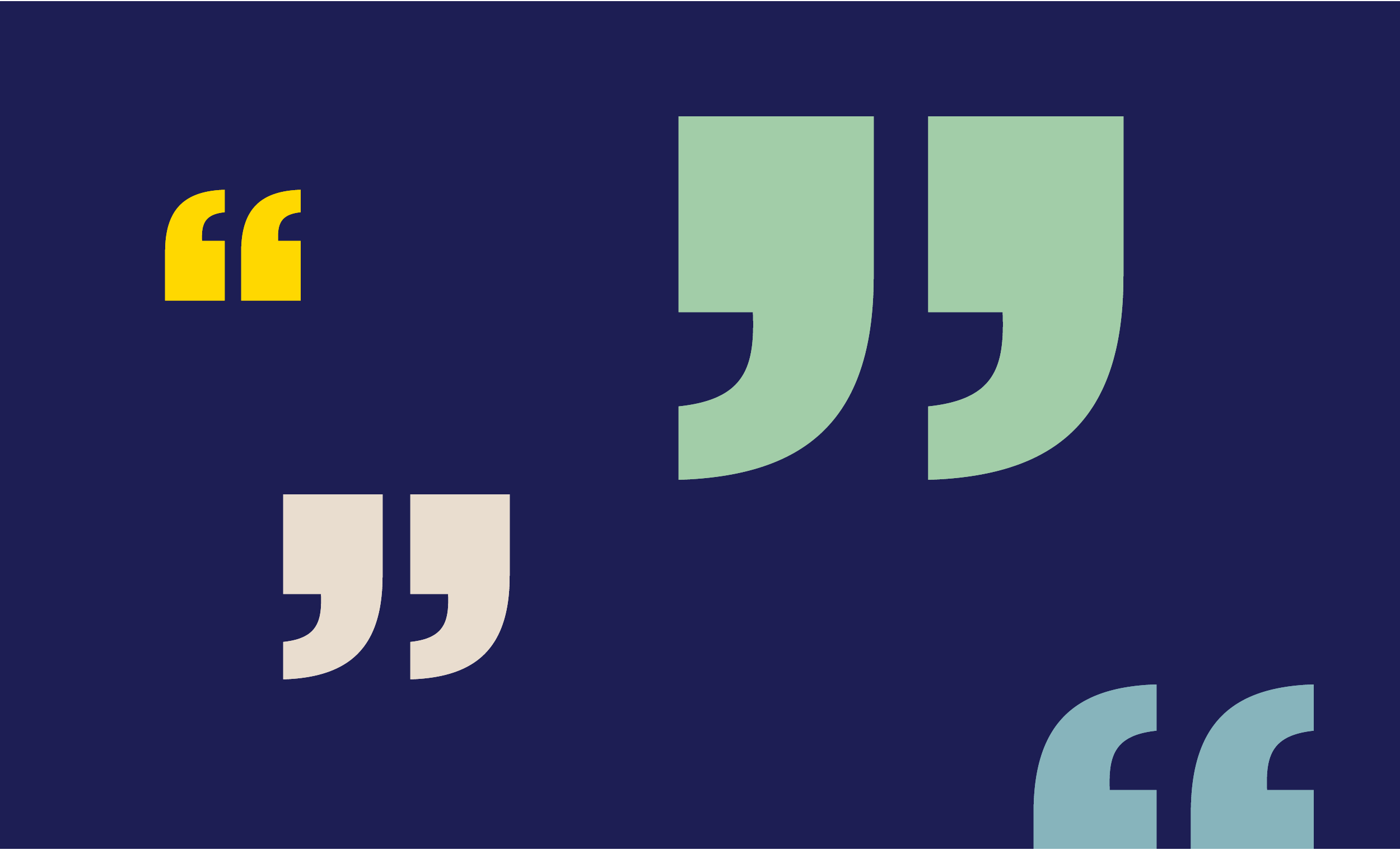
To make sure Indypendently has differentiating typography at its disposal, we took a dual approach. Our first tactic was to take the two font families Indypendently was already using in its website interface and combine them with shapes, symbols, and patterns to create simple typographic illustrations. We also created a custom geometric display font—once again transforming an assortment of simple building blocks into a vehicle for conveying a unique, branded message.
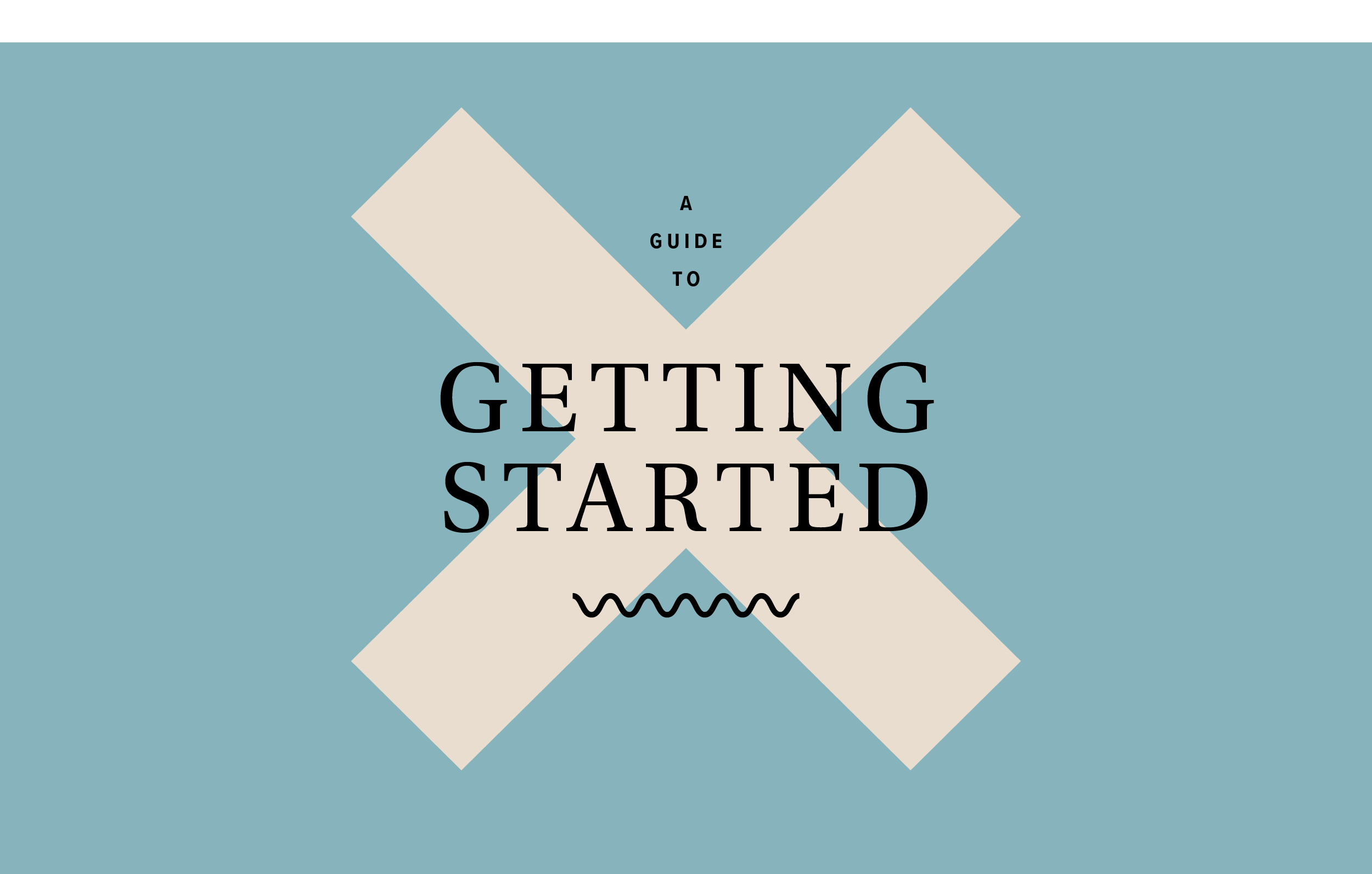

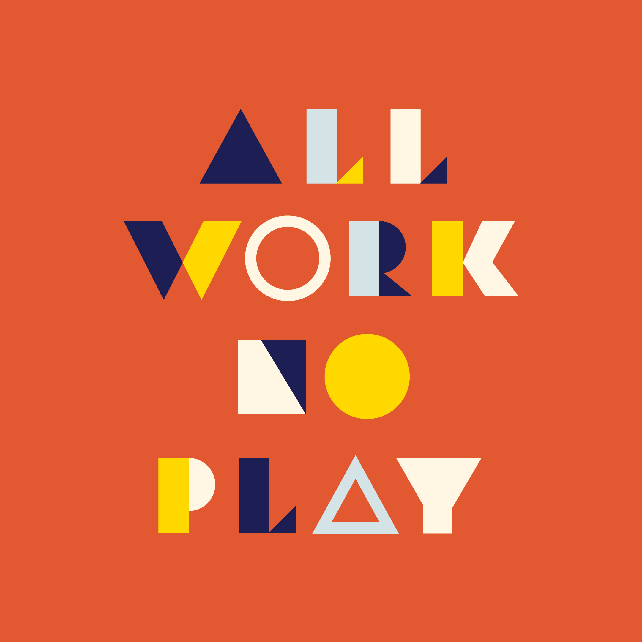
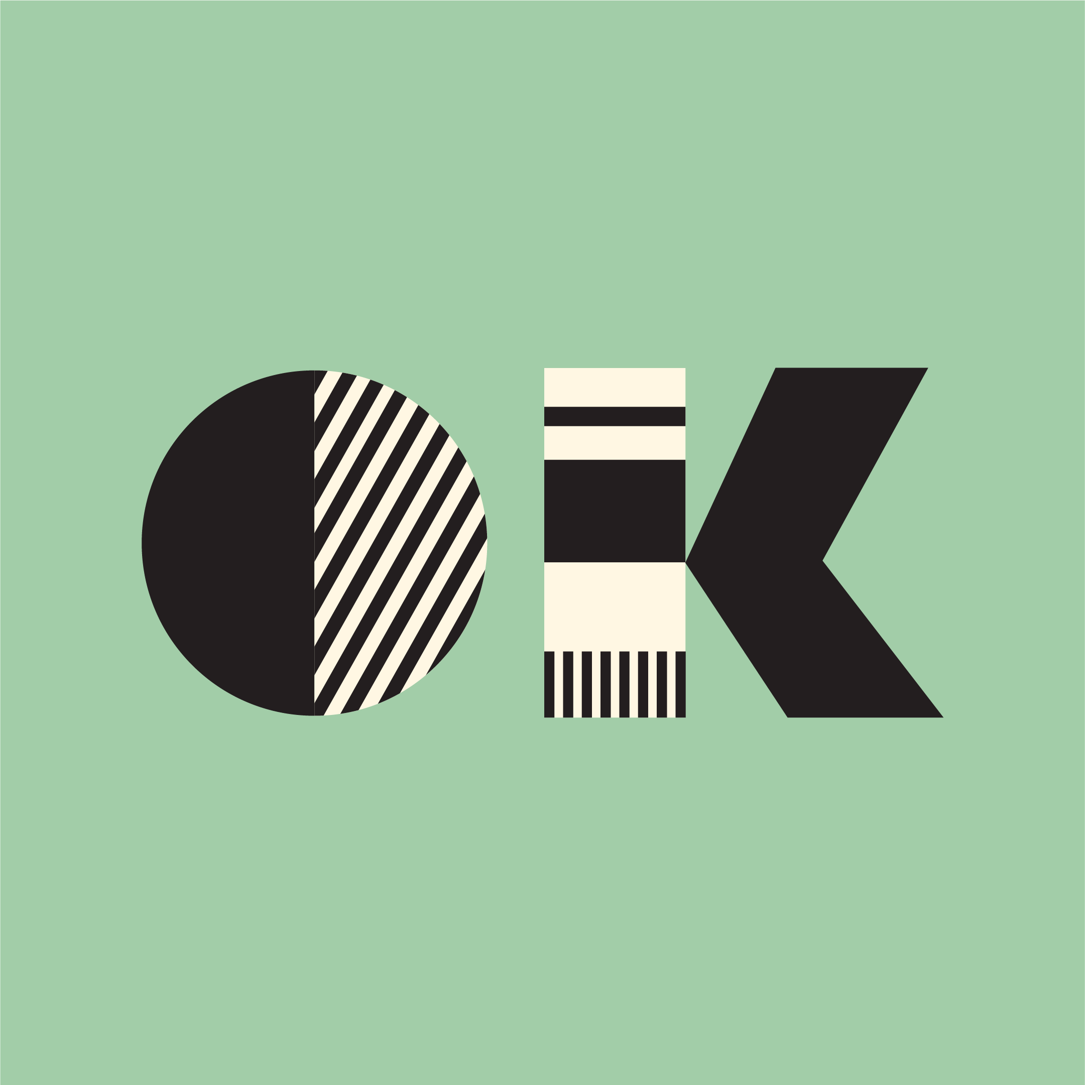
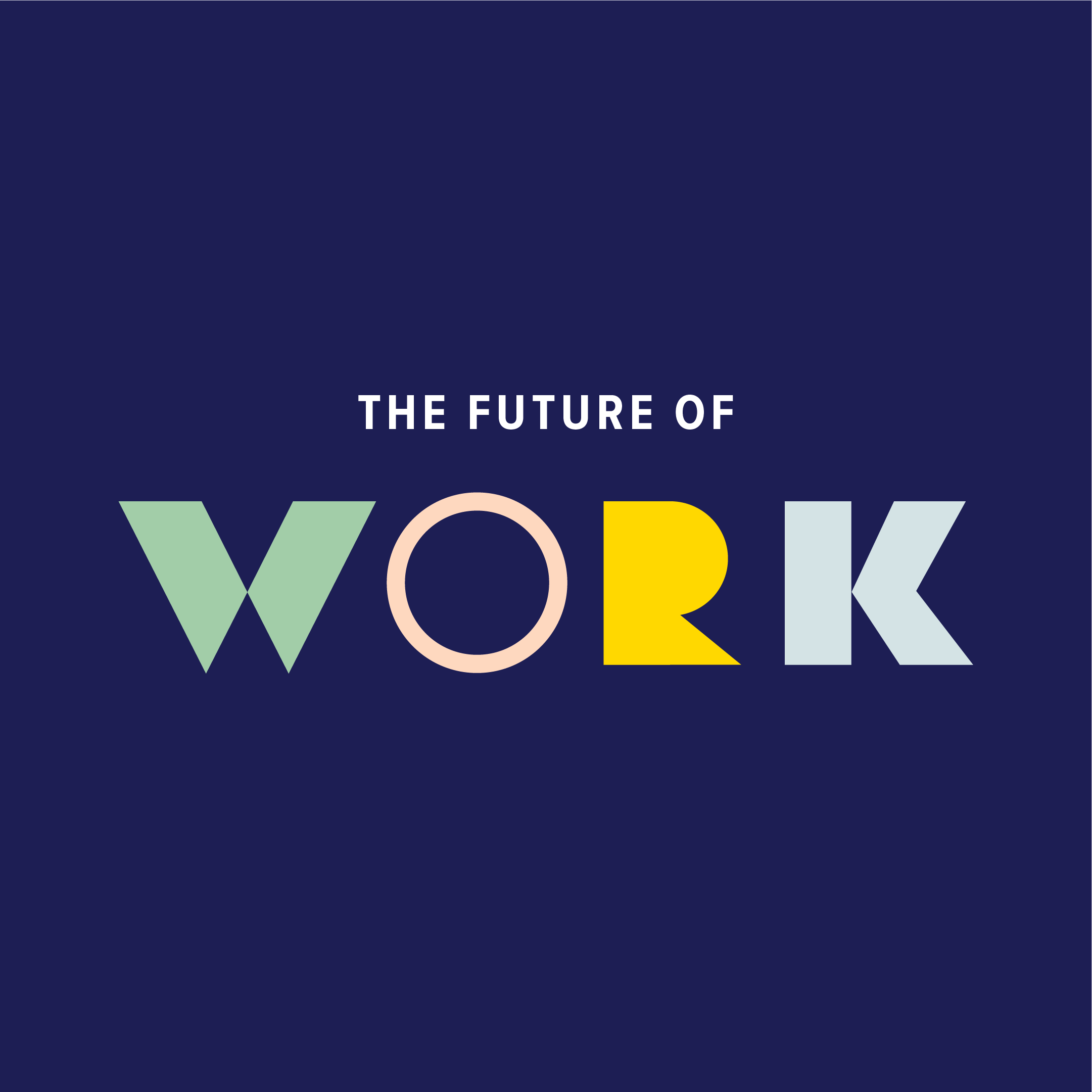
Photo Treatments
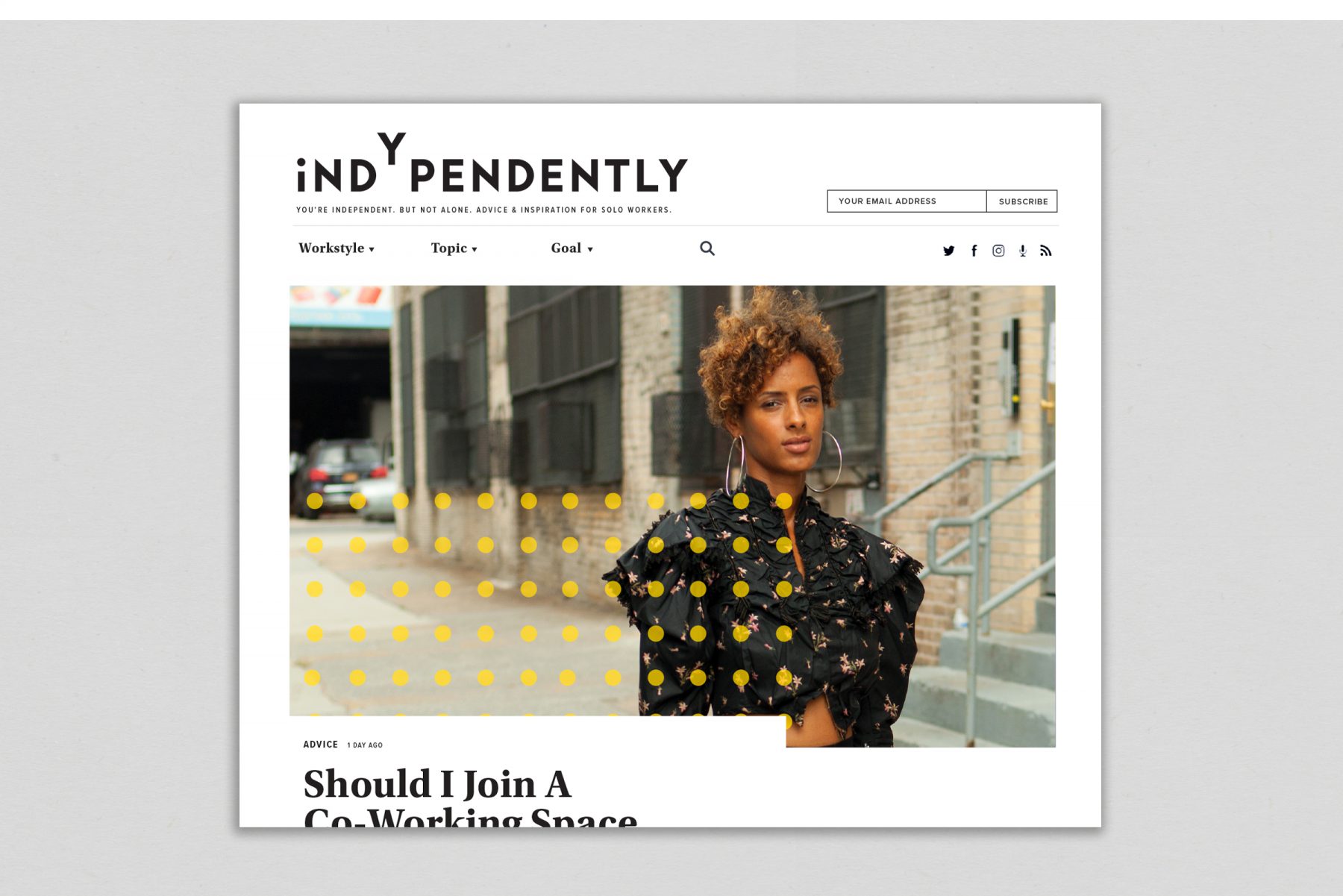
Last but not least, we developed a variety of photographic treatments for Indypendently. These allow the editorial team to overcome common challenges, such as photography that’s provided in the wrong orientation or which suffers from poor lighting or color. These treatments also allow the team to add a branded element to stock photography, giving Indy’s photos a proprietary look even when commissioning custom photography isn’t an option.


