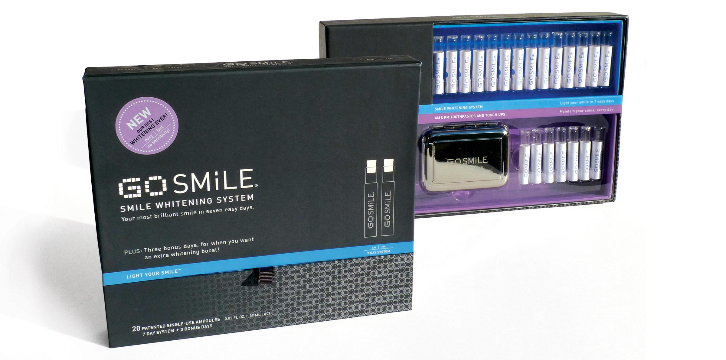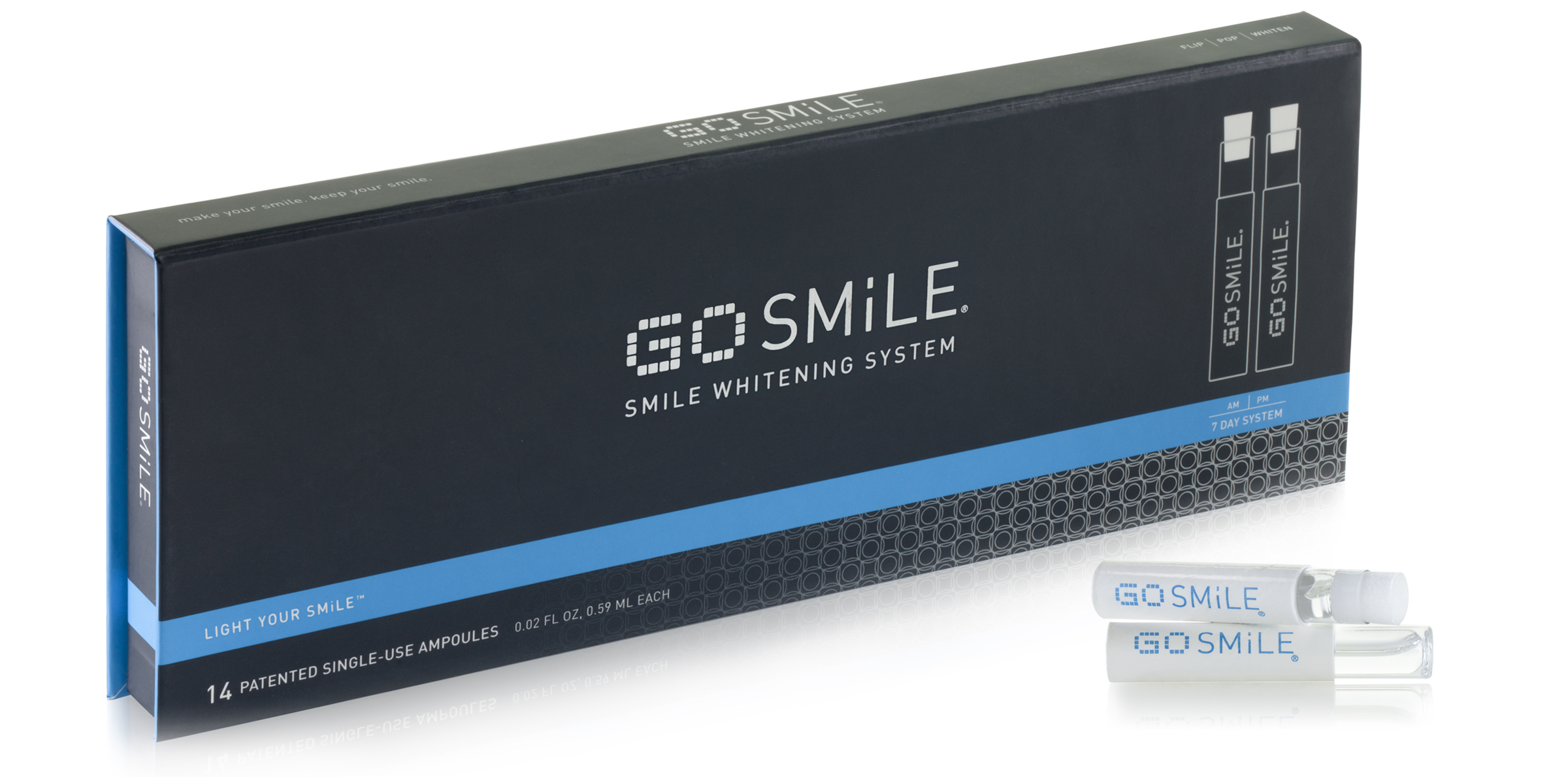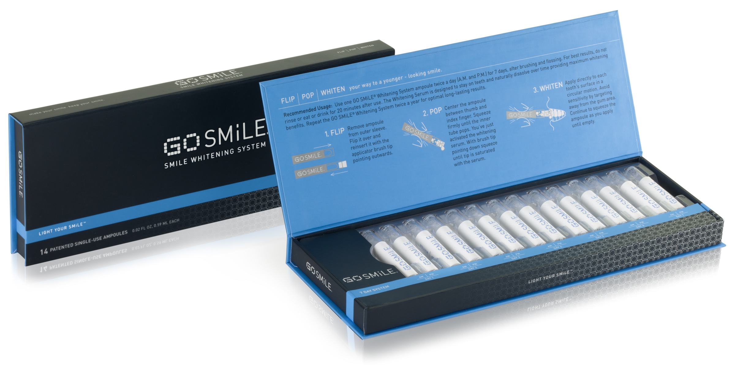
The packaging has a solid, smooth feel in your hand. The lid flips open to reveal the instructions and there’s a nice magnetic snap on closing the box. FLASH LiTES is a daily use touch-up product, we wanted to encourage an impulse buy at the checkout counter, similar to a box of mints. We developed a unique construction for the folded sleeve and slide out tray, keeping the product protected in your purse, yet easy to access.
GO SMiLE
Smile Whitening System
GO SMiLE and their strategy partner, Tattoo, came to us to rebrand and repackage GO SMiLE, Smile Whitening System as well as develop the FLASH LiTE’S companion product. The goal was to better fit the luxury, personal care category and to stand out in retail environments such as Sephora and Nordstroms. Information architecture, brand messaging and a library of design assets were key components to the redesign allowing the product line to grow with ease and consistency.
GO SMiLE’s proprietary delivery system–the ampoule–is reinforced throughout the redesign of both the logotype and the packaging to help differentiate this brand from other teeth whitening products. It was important that the brand be gender neutral, clinical and yet fit into the cosmetic beauty category as well. We worked extensively with stock photography and photo retouchers to develop a library of about 300 ownable “smile images” for a variety of applications. A detailed style guide provides instructions for the use of the new assets.