dpHUE

Do Professional, Hair Color

dpHUE is an innovative retail beauty concept that began as a professional quality DIY hair coloring system, and which has since expanded to encompass a variety of hair care products. WDW helped define the company’s brand name, visual identity, packaging design, and retail presence. As dpHUE has grown, we’ve continued partnering with them to enrich and expand the brand. The visual language we developed plays out across a wide variety of products and applications; the images shown here are a small sampling of that work.

dpHue hair care packaging by Werner Design Werks dpHue hair care packaging by Werner Design Werks dpHUE packaging design by Werner Design Werks

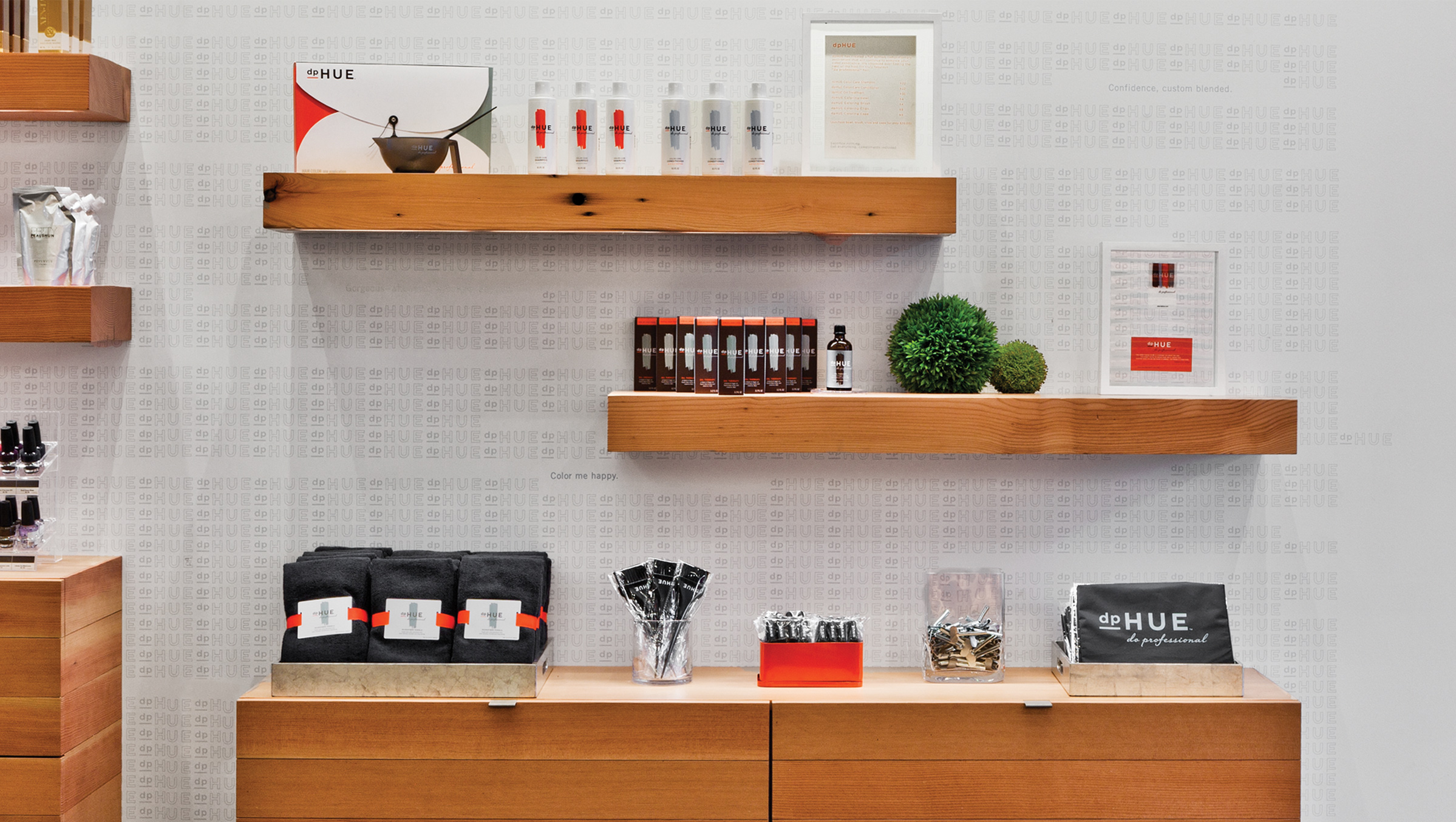
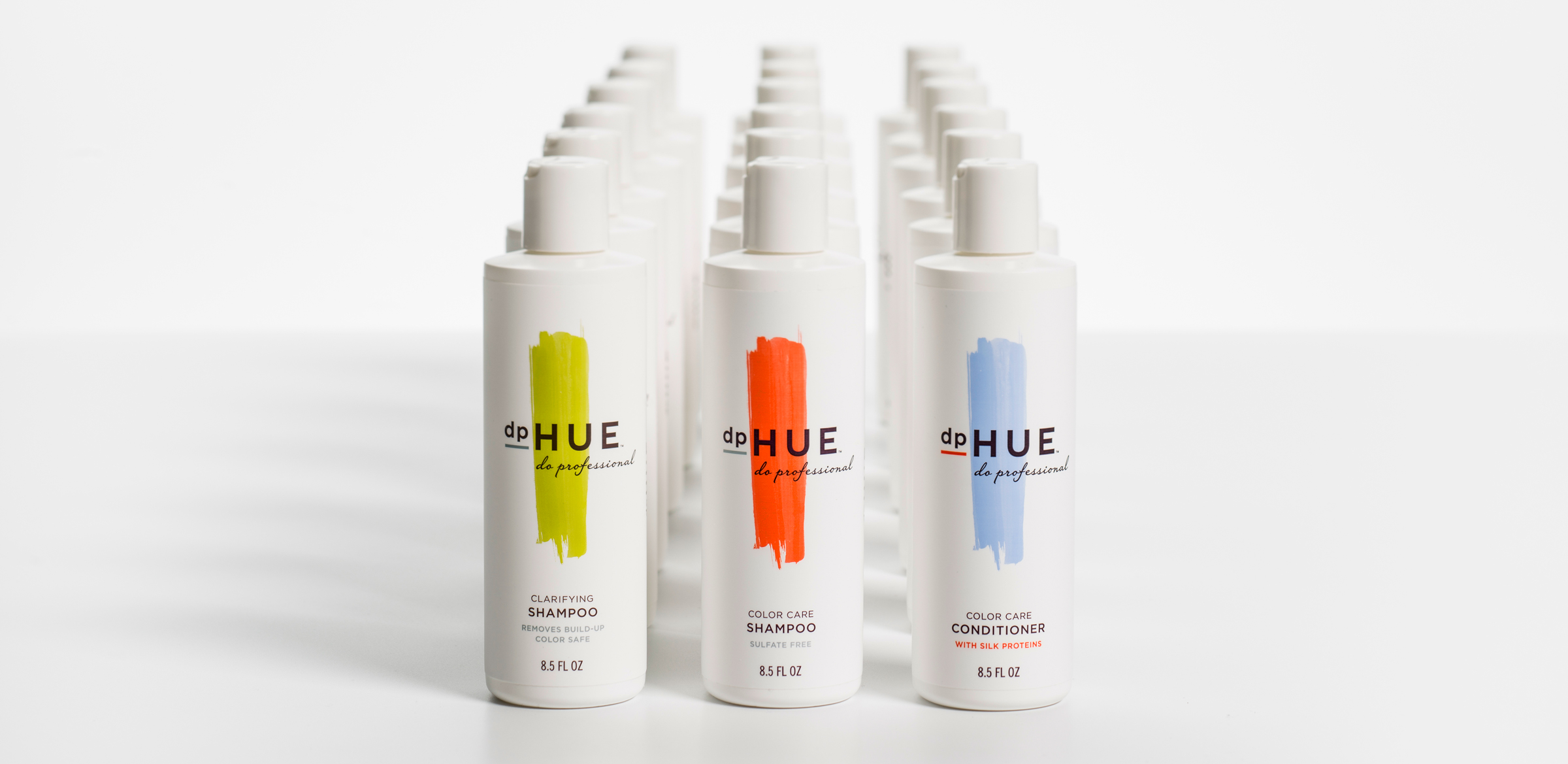
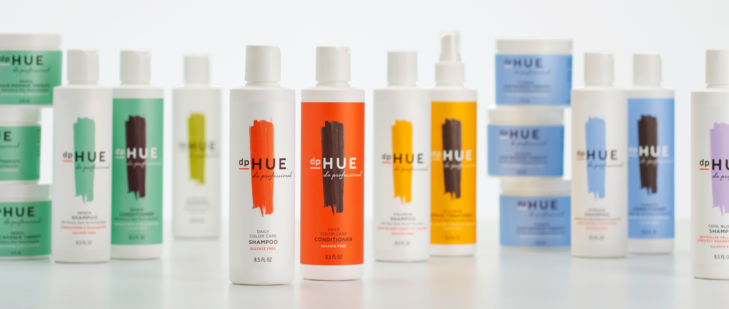
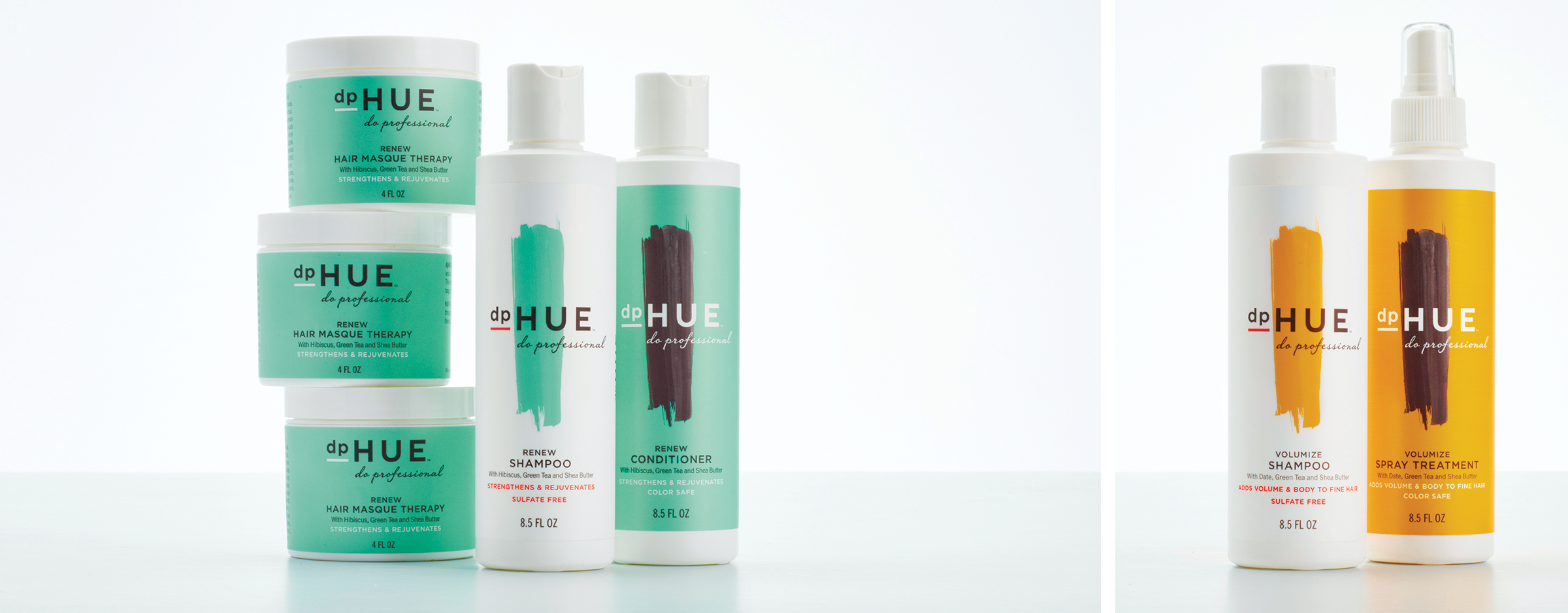
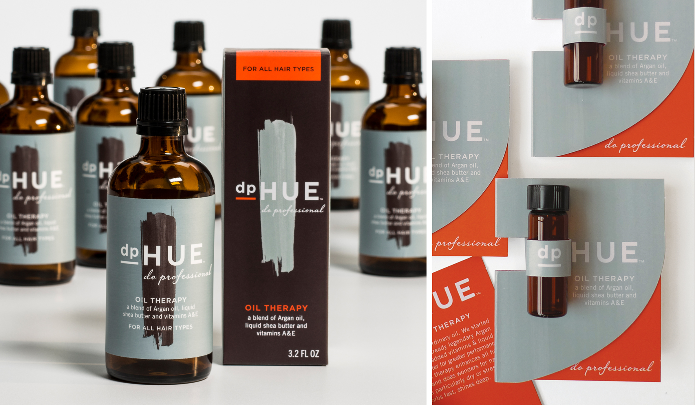
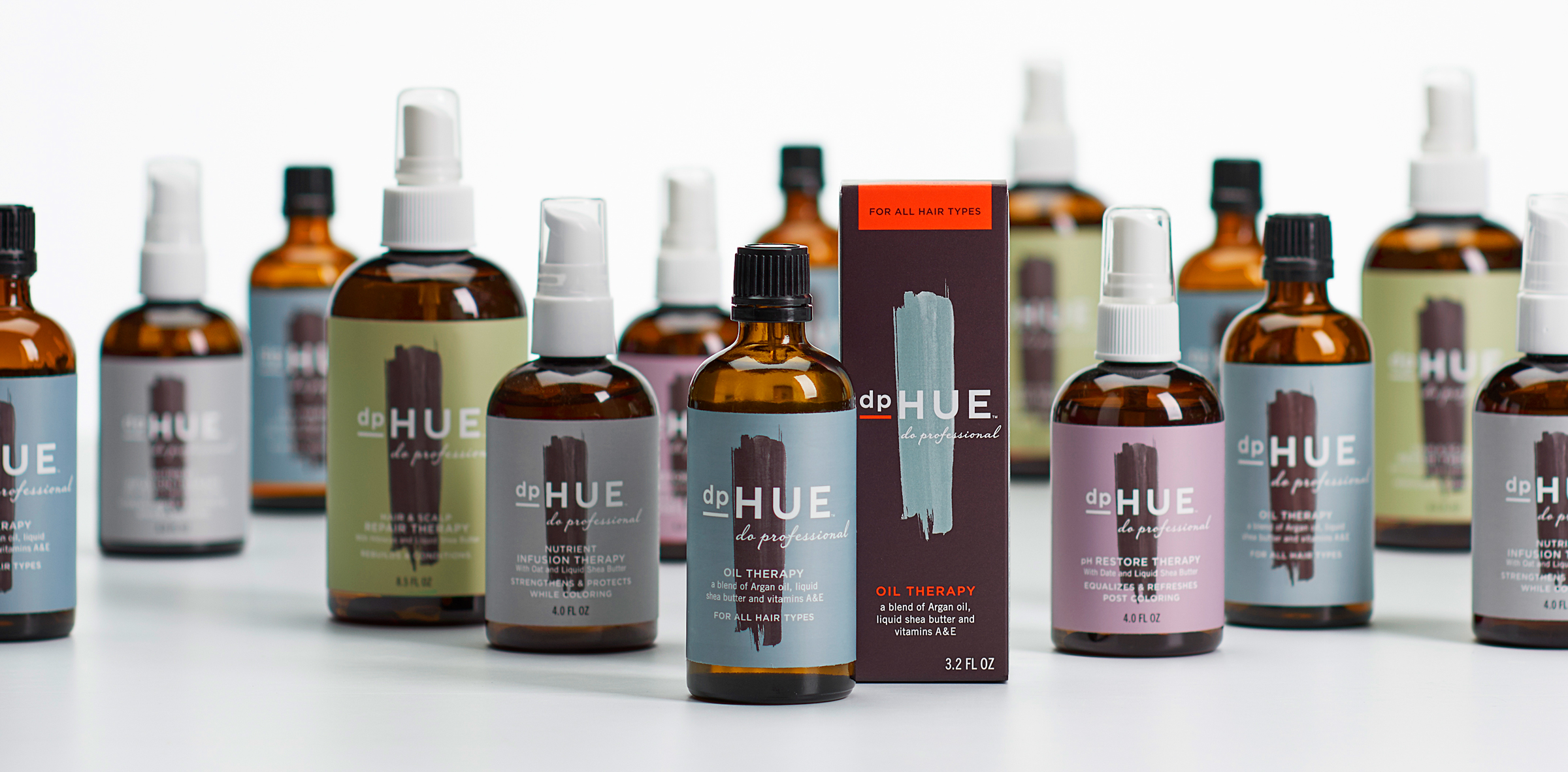
The dpHUE hair therapy product line restores damaged hair to health.

oilwithsampleoil dpHue hair therapy packaging design by Werner Design Werks


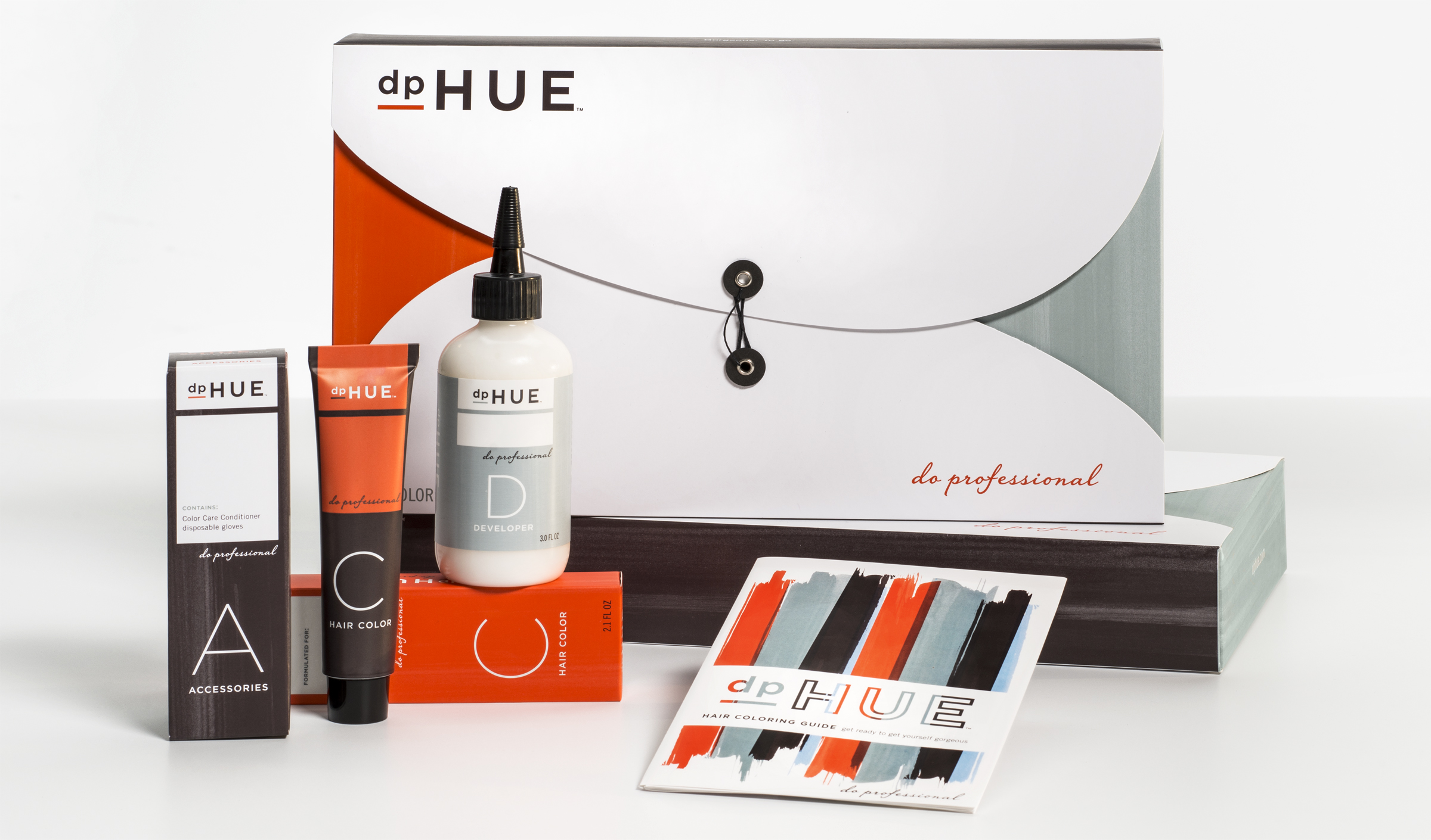
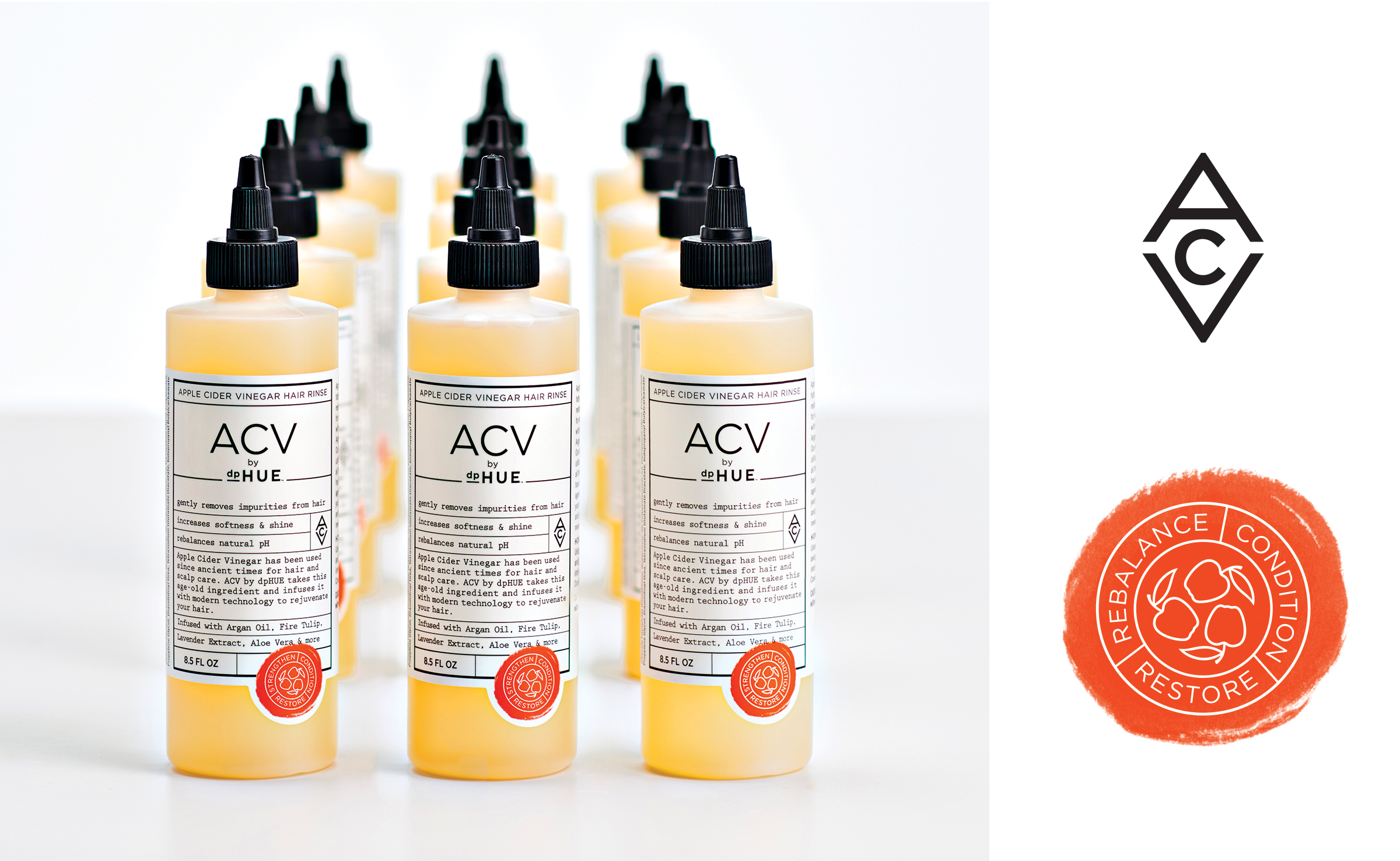
dpHUE’s Apple Cider Vinegar line has been wildly popular, and will soon be expanding beyond the original ACV rinse.


dpHUE ACV packaging design by Werner Design Werks shoppingbag appconcept

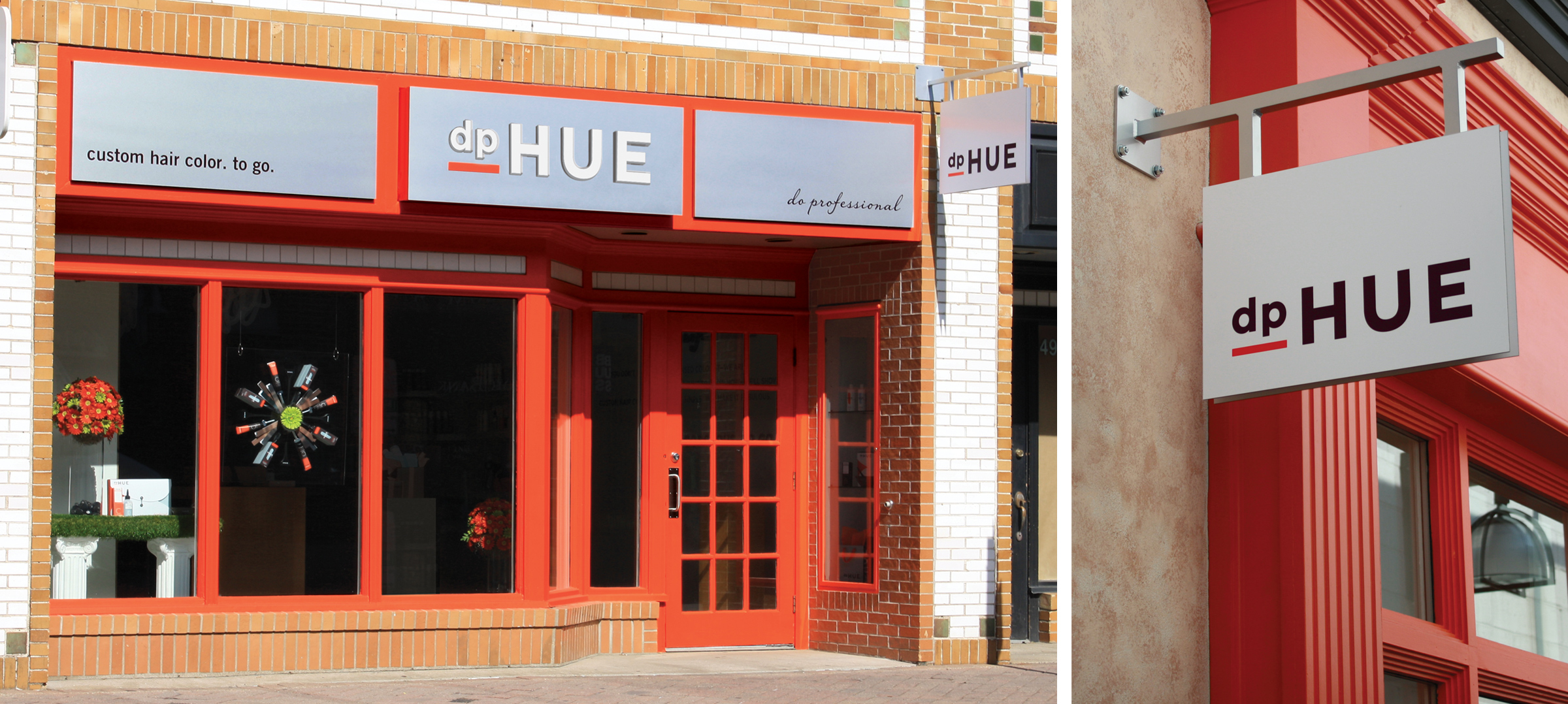
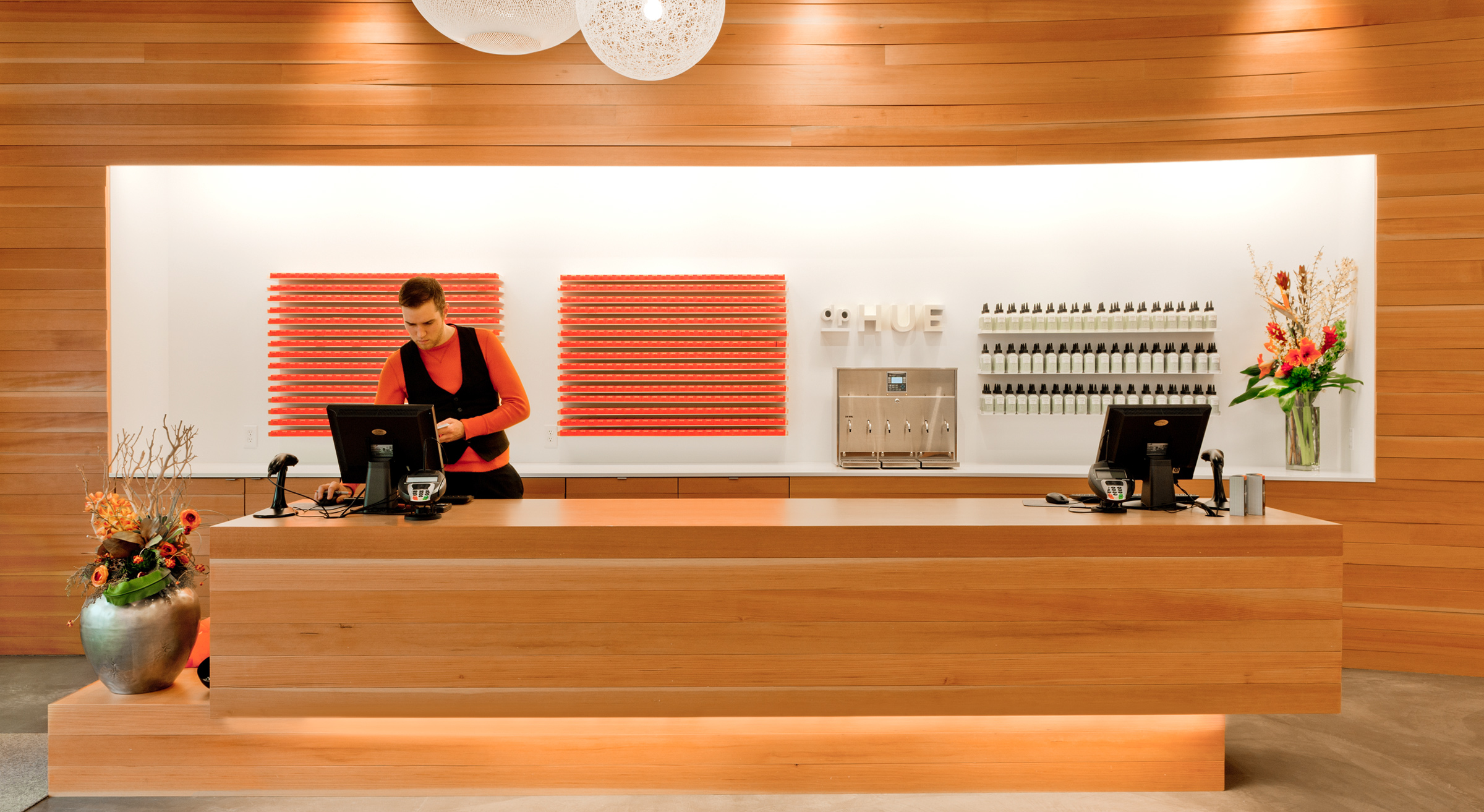
WDW had the pleasure of working with Snow Kreilich Architects on bringing the brand vision into the retail environments. The grid of hair color product behind the cash-wrap creates a central focal point and reinforces the linear details. The slab shelf fixture replicates the bold underline in the logo.

50thfranceexterior
dpHUEinteriorsign woodwallinterior shelfwithproduct

Werner Design Werks
1229 Payne Ave
Saint Paul, MN 55130

(651) 291-2660
info@wdw.com