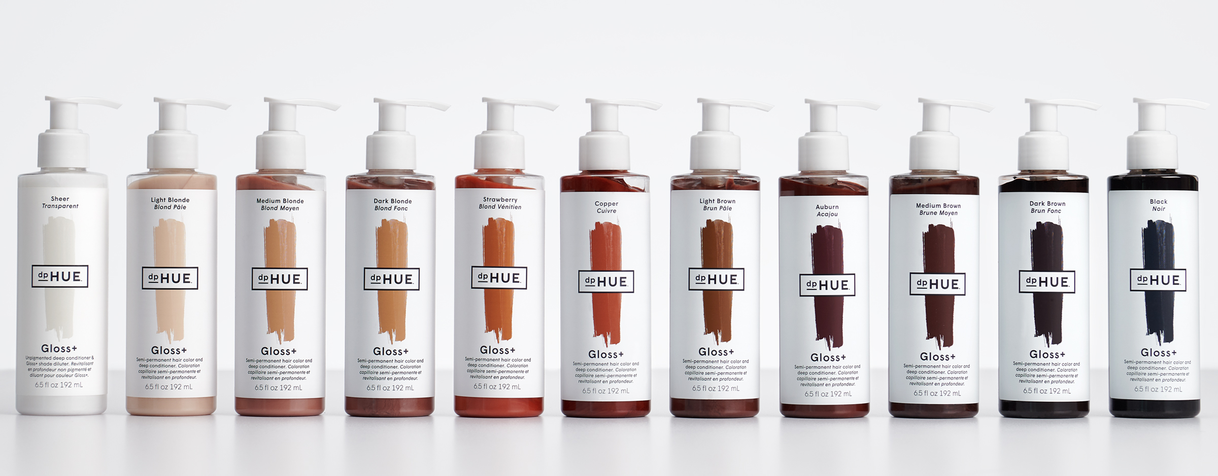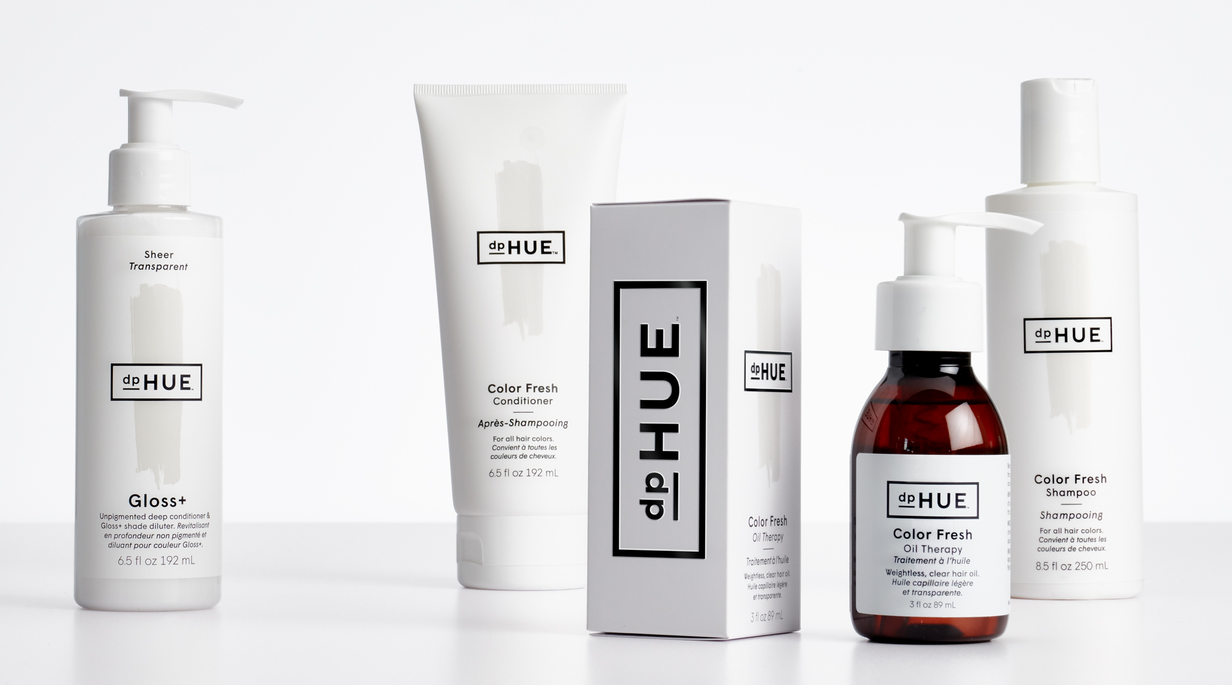


A little freshening up for dpHUE, a brand we helped create in 2010. In the time since we did the original dpHUE branding and packaging, dpHUE has further defined and honed their expertise and focus. In 2010 they launched with a simple but unique offering: professional quality at-home hair color kits. Since then they shifted to a broader mission and product line: everything you need to maintain “fresh color between salon visits.” They went from their own store and online experiences, into retailers such as Sephora and Ulta, where the packaging had to work much harder to communicate. They opened a dpHUE experience salon in LA. They were entering the Canadian market which meant dual languages on the packages. With all of the changes the original branding was not working as hard as it could, so it required a refresh. The goal was to position dpHUE for significant growth over the next five years.
The entire brand refresh is built on color—specifically hair color. dpHUE created a new merchandising strategy that focused very intentionally on telling a hair color story. We eliminated color as brand decoration and kept it focused on hair colors, making it easy for consumers to shop according to their hair color. We introduced a neutral palette for products that are for use on all hair colors. We worked with strategist Julie Kucinski to update the brand’s new focus with both a functional story: fresh color between salon visits, and an emotional story: live in full color.


© 2026 Werner Design Werks