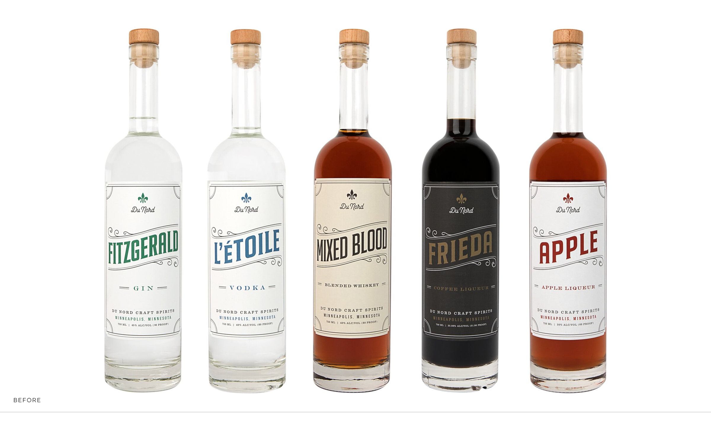
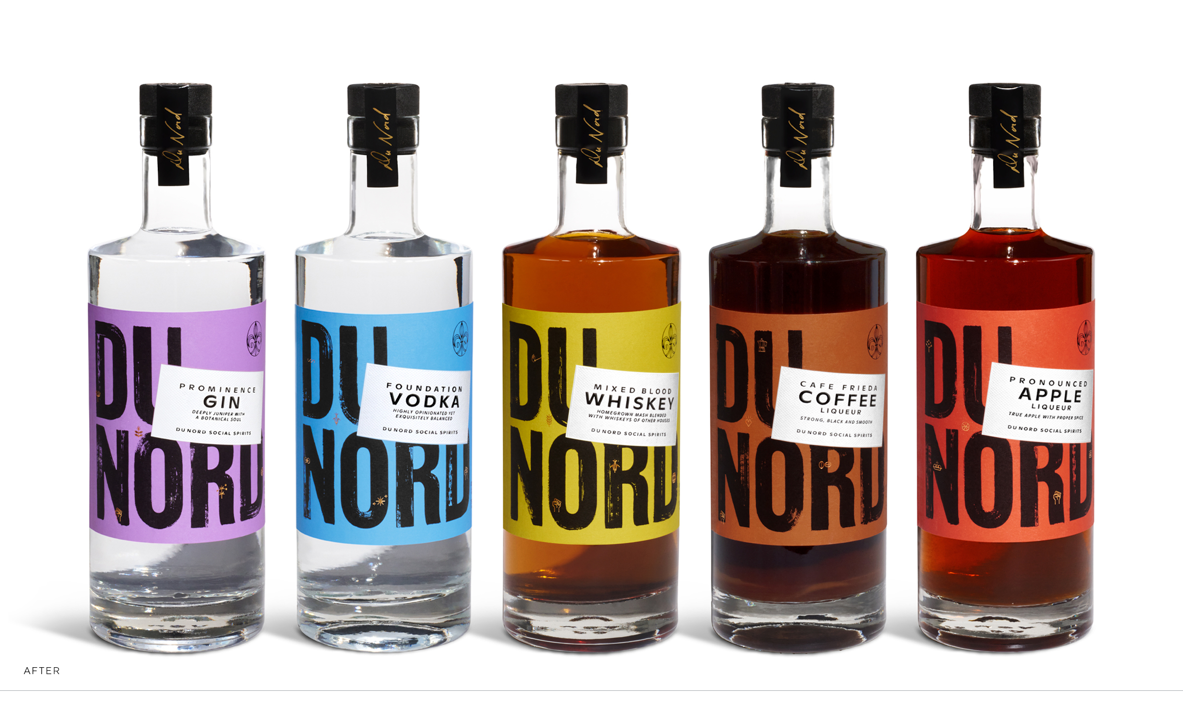
Who doesn’t love a good before and after story? The Du Nord Craft Spirits “before” brand and packaging wasn’t broken, it simply no longer represented who they’d grown into. It didn’t represent their amplified voice in the community and the industry. We incorporated a subtle but hard-working name change. New and evocative product names, when needed. A solid-profile bottle–to exemplify the everyman and short enough to shelved at eye level. Along with fiercely bold labels indicative of Du Nord’s powerful and diverse team.
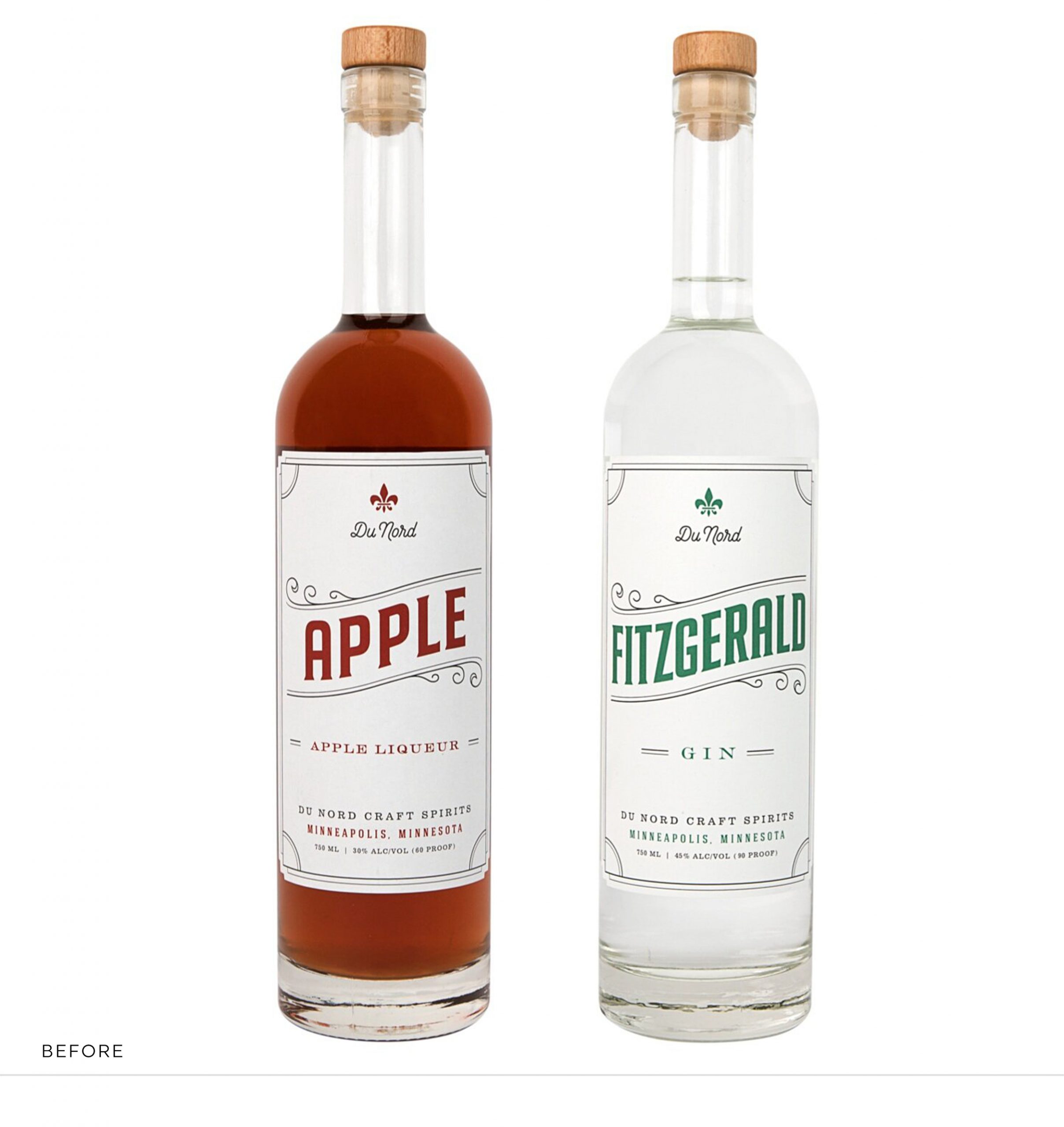
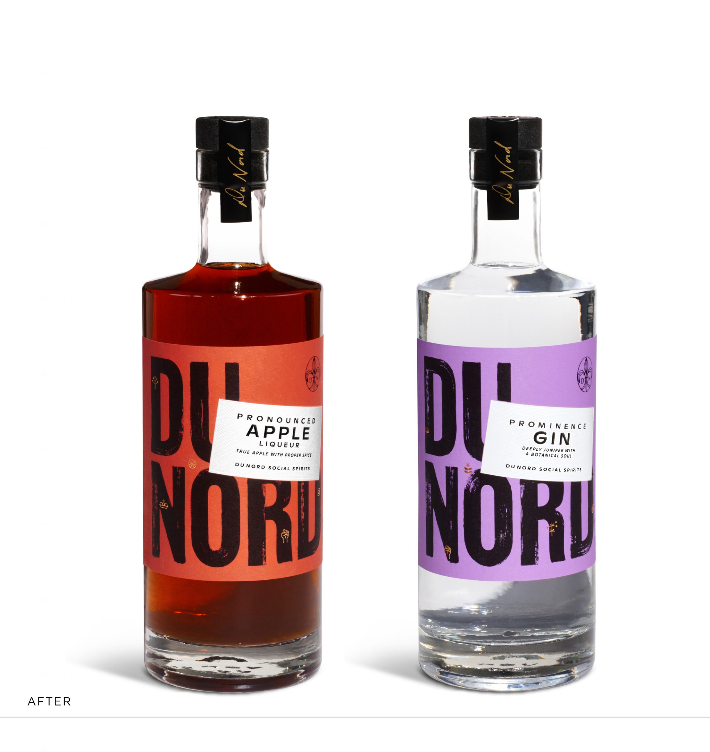
A new logo that is loud and proud with “social spirits” as an important part of the name and the mark. Because Du Nord felt no connection to the heritage of traditional liquor packaging, we wanted to build on their own personal brand heritage. So we maintained and refined elements like the fleur-de-lis and incorporated a script signature on the neck label.
The new packaging is brand-forward and conveys high-quality premium spirits without being fussy or fancy; or as Du Nord describe themselves: “semi dapper.”
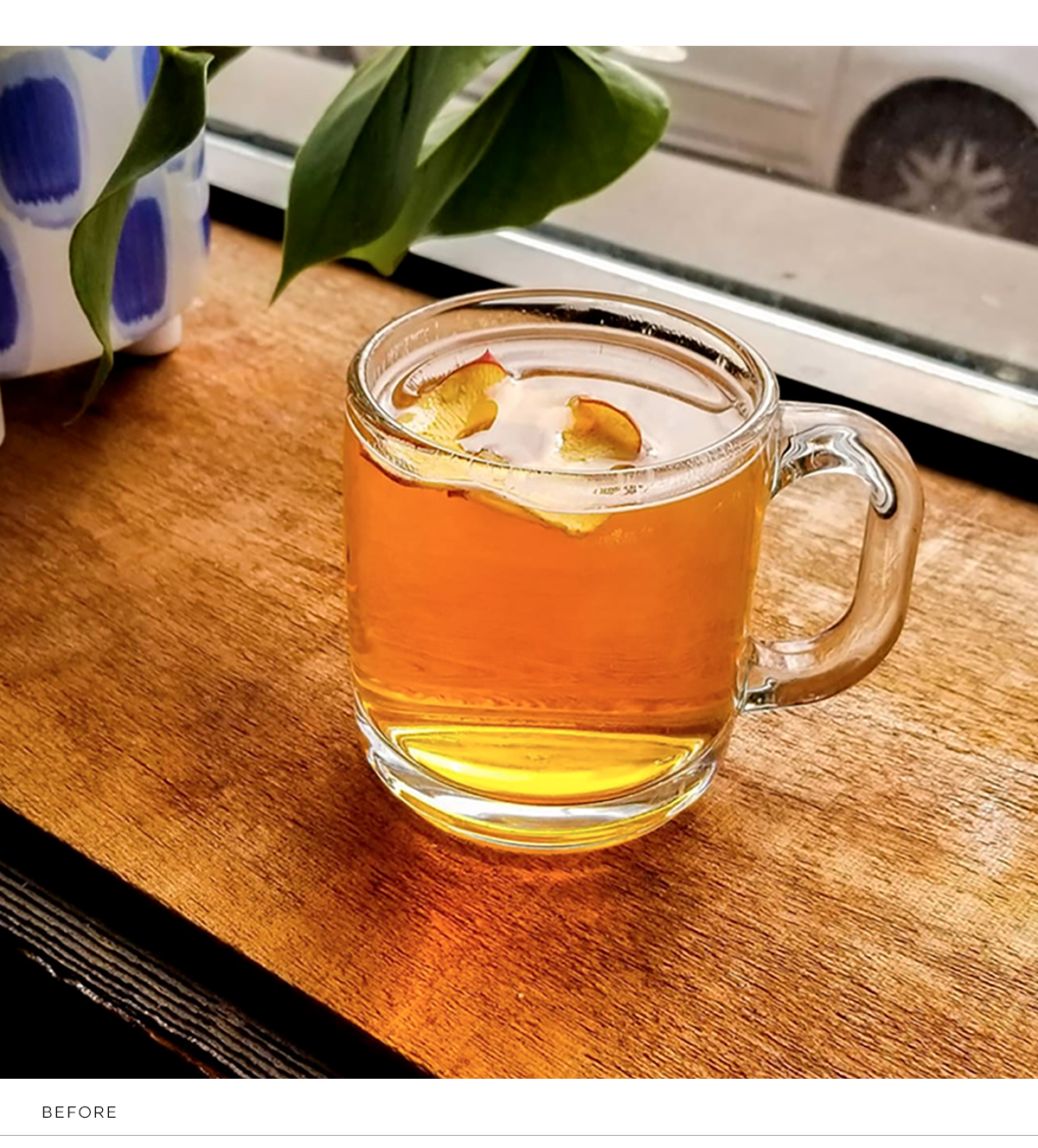
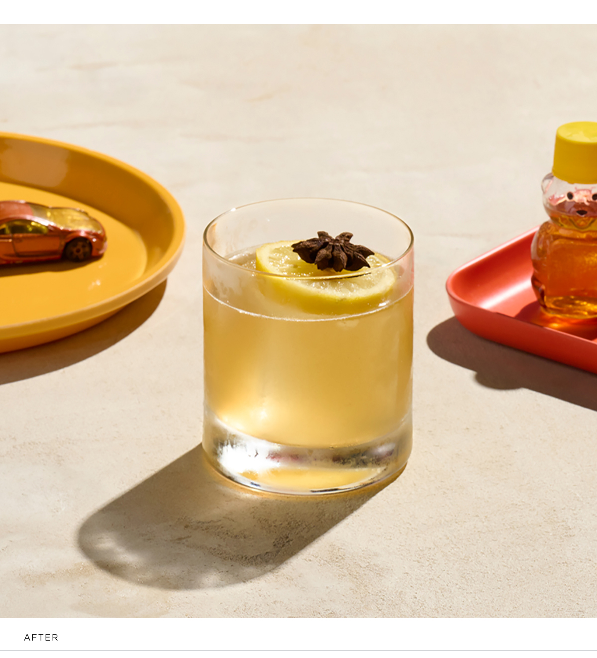
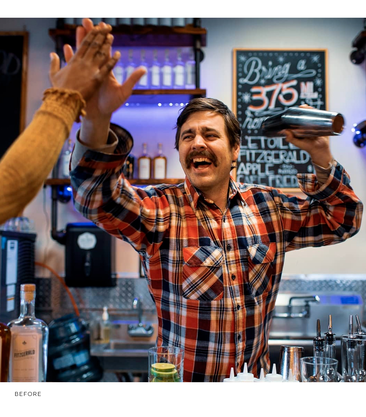
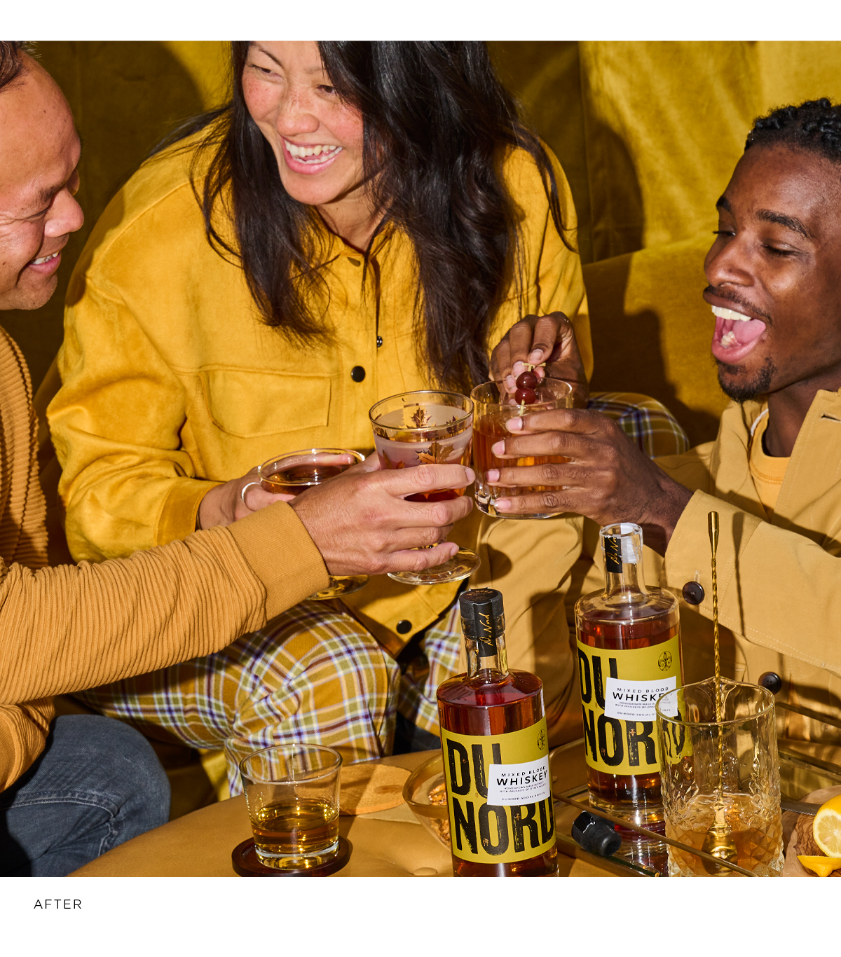
We developed a style of photography for product, cocktails and lifestyle that has a distinct point of view. An initial photoshoot provided Du Nord with an extensive image library as well as style benchmarks for future photography. Of course it will continue to evolve to keep it fresh but it starts with this solid foundation.