As part of an ongoing rebranding partnership, we’ve had the pleasure of working with Cabot Creamery, a farmer-owned cooperative known for their amazing, award-winning cheddars. We’ve brought the brand’s modern rustic strategy to life, updating the Cabot look while enhancing their authentic heritage and broad appeal.
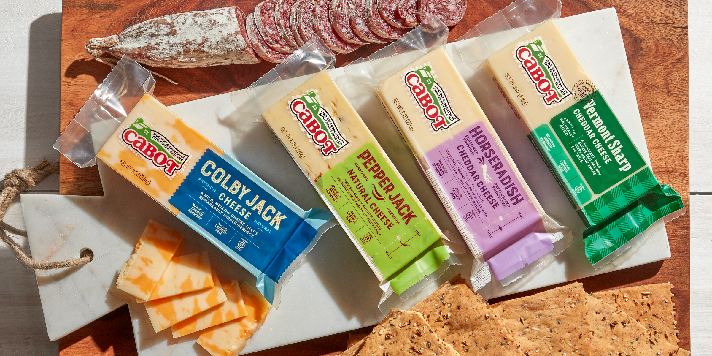
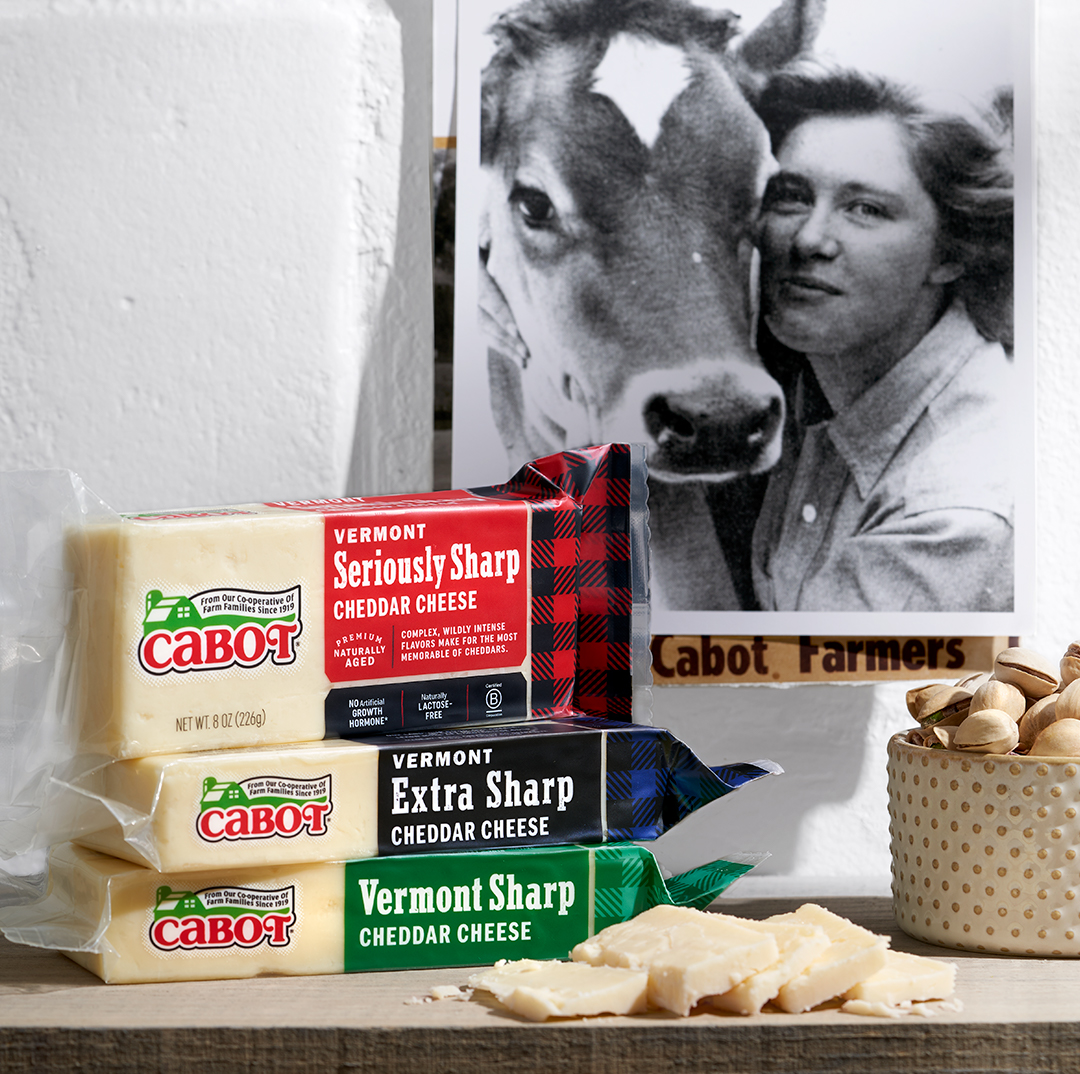
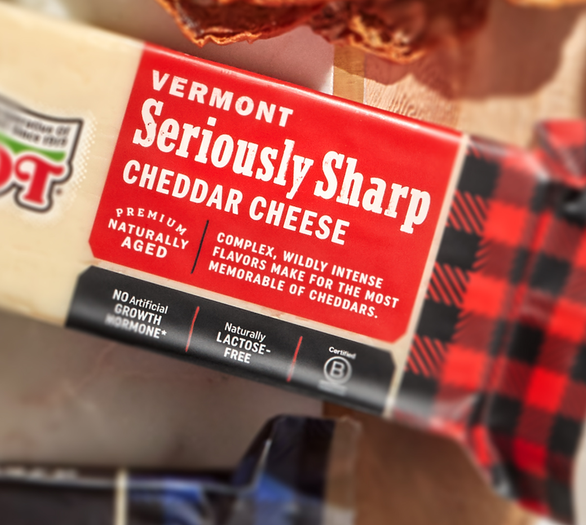
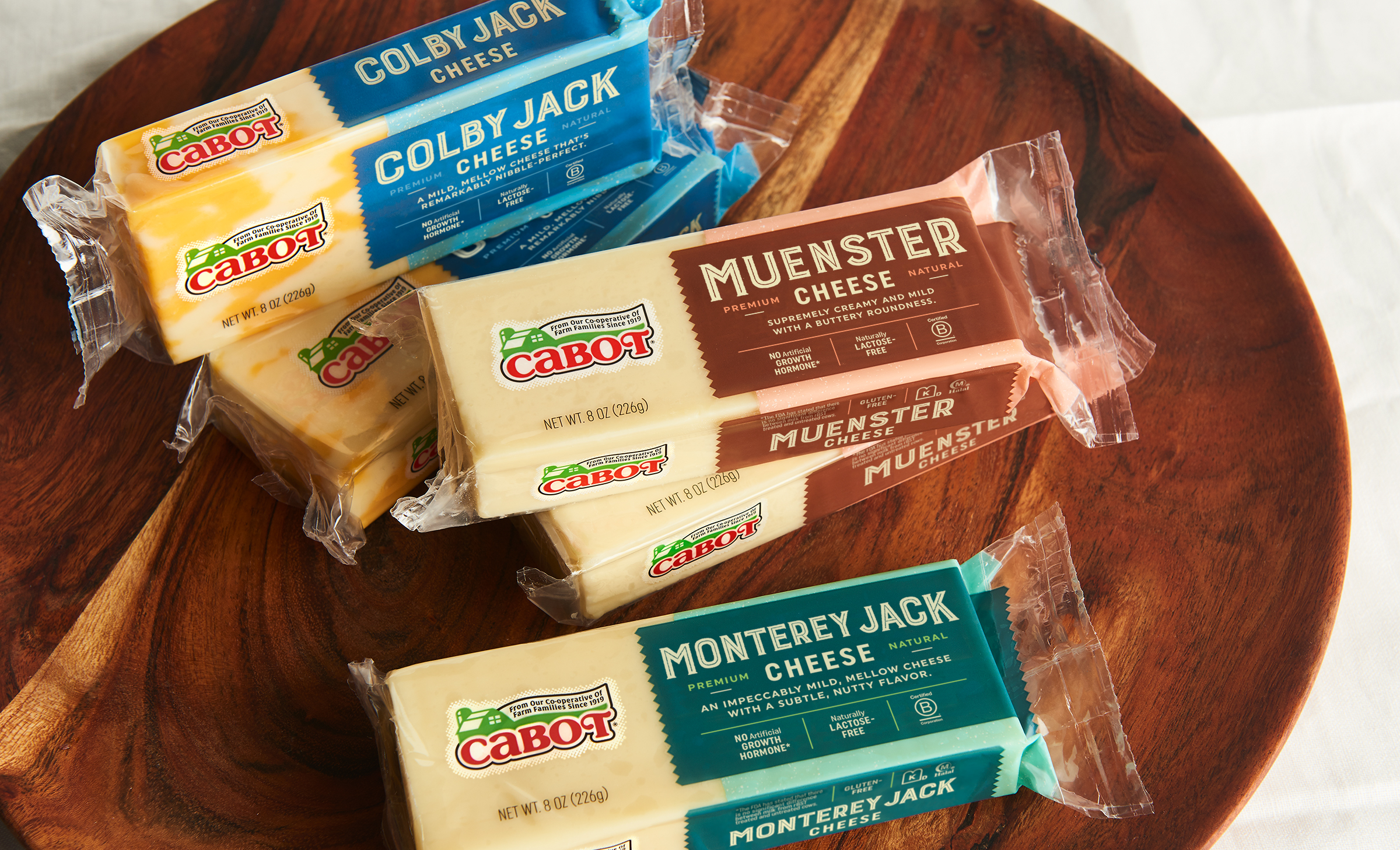
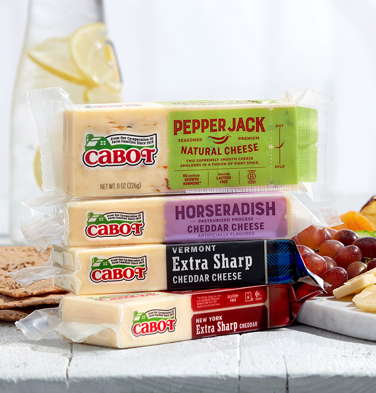
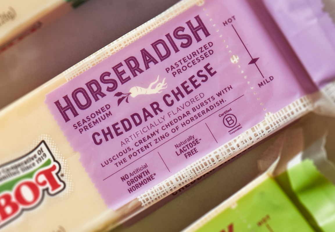
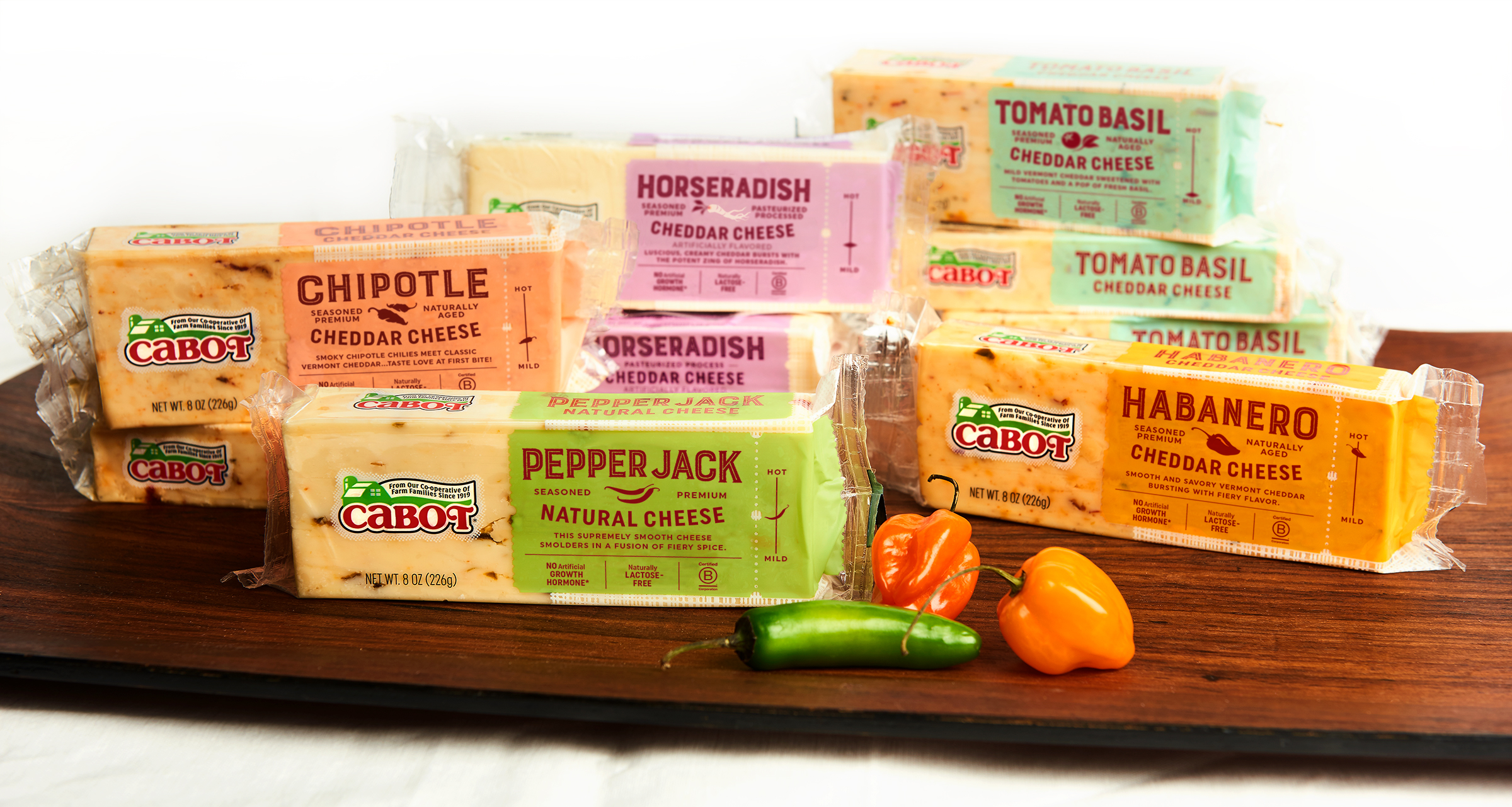
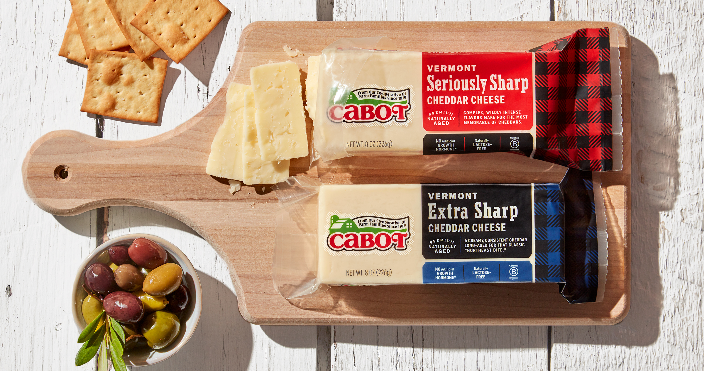
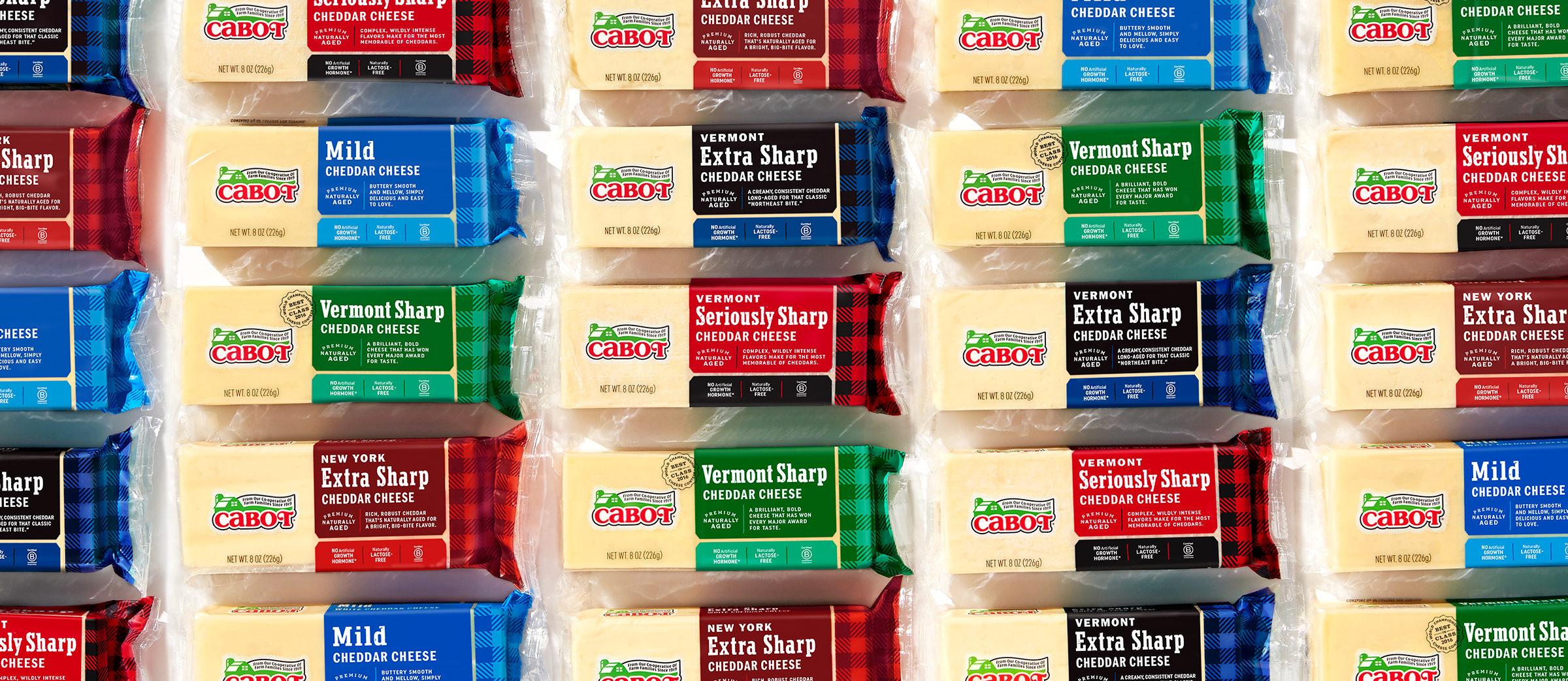
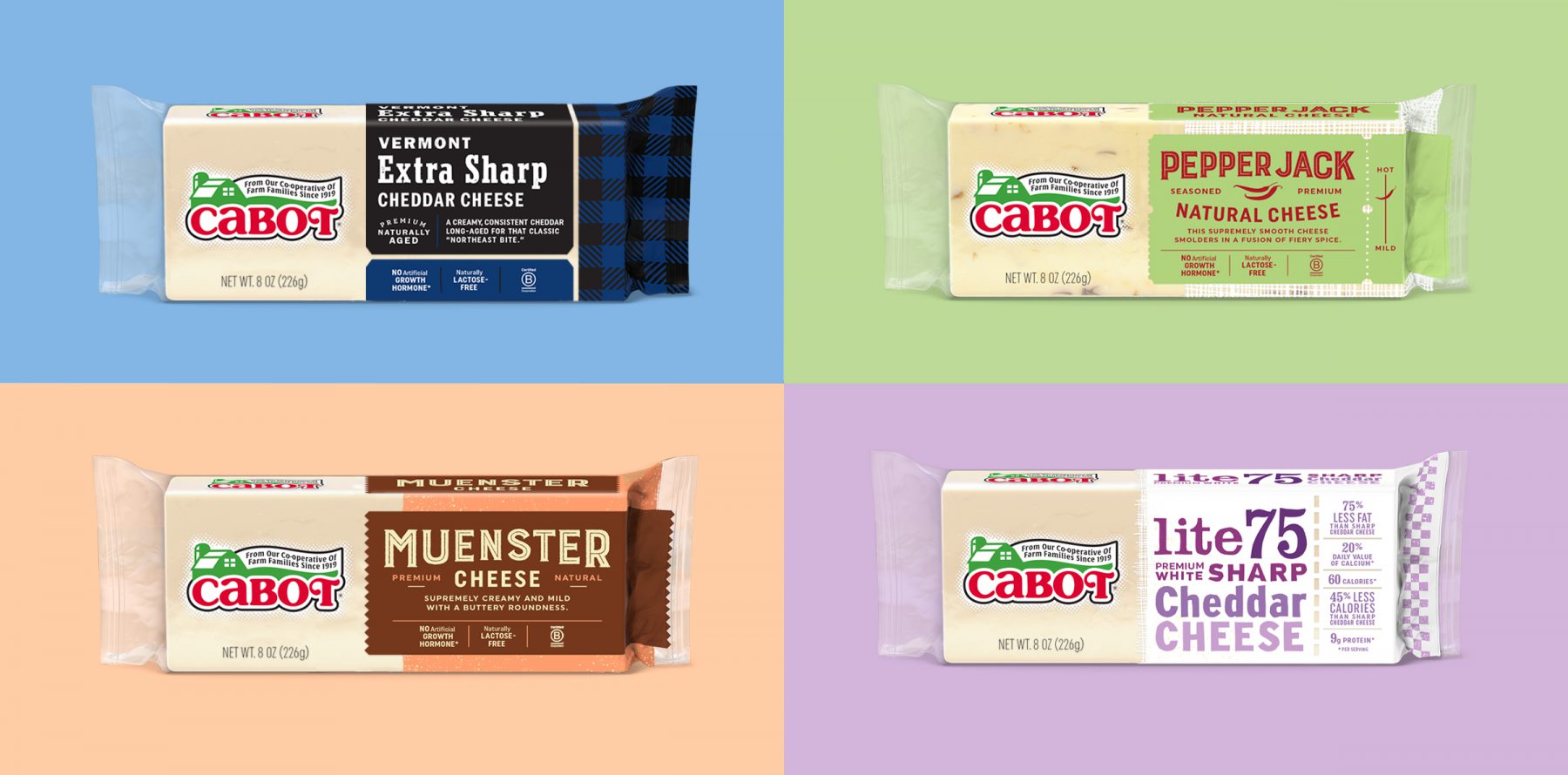
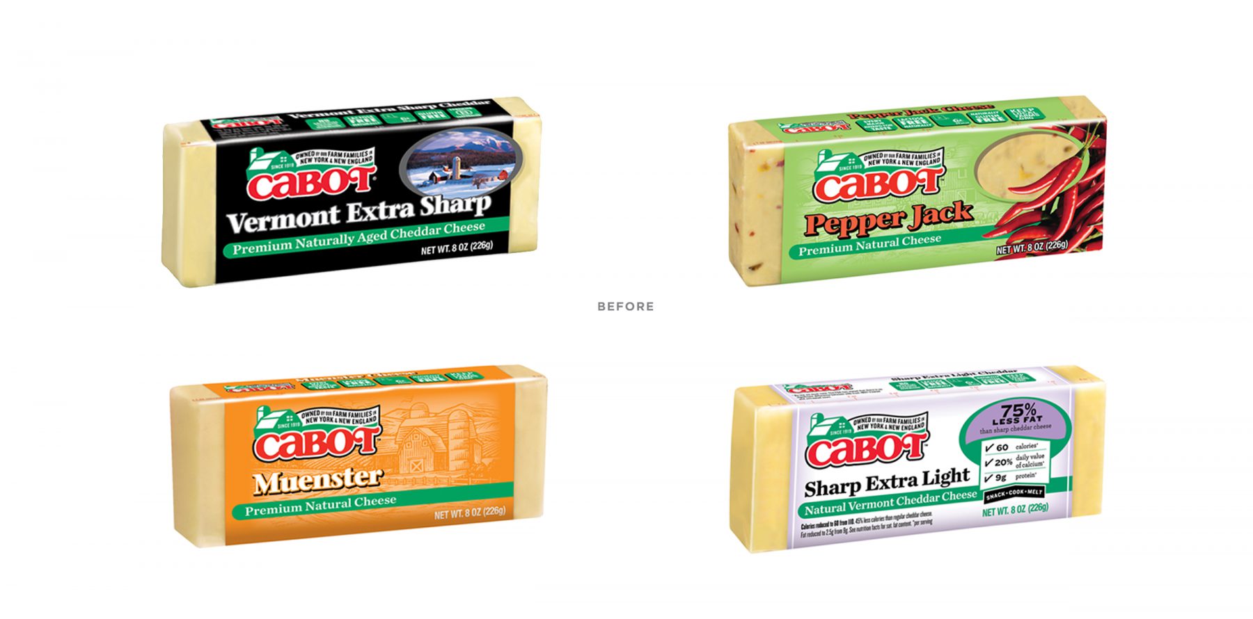
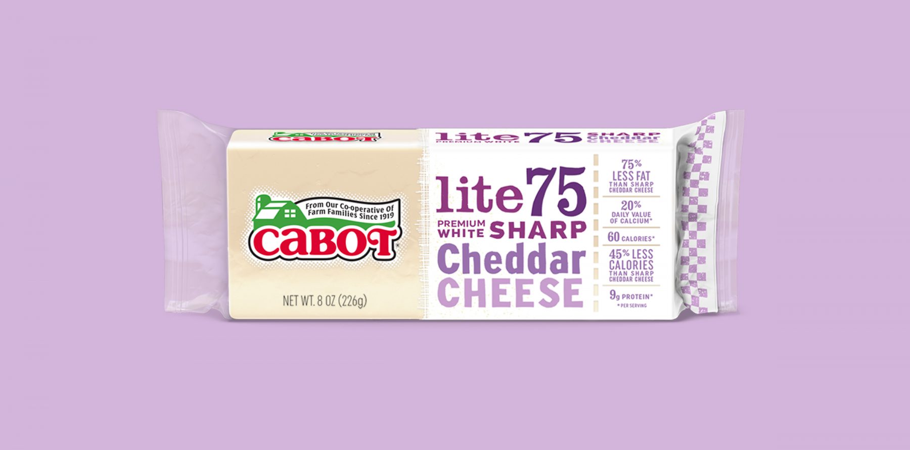
To many of their loyal fans and co-op farmers, Cabot is especially known for their Vermont Seriously Sharp Cheddar with its plaid packaging. We decided to make plaid the hero of the core collection of classic cheddars. In addition to these classics, Cabot has three other main collections of cheeses: seasoned cheese, non-cheddars and Lites. We gave each of these collections a distinct look within a cohesive information architecture. The clear window to the cheese is a clean backdrop for the Cabot logo while the consistent position of the cheese name makes for easy shopping. Overall the rebrand creates an impactful Cabot presentation in the cooler, communicates the ethos of the farmer-owned co-operative and gives the people what they want: plaid!
We continue to work with Cabot to implement this new look across Cabot’s broad array of dairy and deli cheeses.
Thanks to Creative Director Mark Johnson of Tattoo Strategy, photographers Todd Hafermann and Ken Friberg, as well as food stylist Maggie Stopera .
© 2024 Werner Design Werks